Which Detroit sports team has the best logo: Tigers, Wings, Lions or Pistons?
Which Detroit sports team has the best logo?
It is a simple question that sparked hundreds of opinions on social media this week, after the question was posed including the logos for the Detroit Lions, Pistons, Red Wings and Tigers. The question, asked by an account called "313 Takes" on X, formerly Twitter, garnered ferocious public debate, as Detroit sports fans staked their case for a favorite logo.
Each franchise has had relative stability with logos throughout their long histories, developing a reputation and giving us iconic moments while donning the Old English D, the winged wheel, the roaring Lion and the red and blue Pistons basketball.
History lesson: Logos of Detroit's professional sports teams through the years
What Detroit team has the best logo? pic.twitter.com/zGaq02PFyJ
— 313 Takes (@313takes) February 21, 2024
When you mention each of those logos specifically, different memories from Detroit sports history, like associating the Tigers logo with Magglio Ordonez's 2006 walk-off home run to reach the World Series, the Red Wings' logo with the dominance of the late '90s and early 2000s, the Pistons logo with the Bad Boys' back-to-back championships, and the Lions logo with ... well, heartache.
The Red Wings have the oldest and most consistent logo of the four Detroit sports teams. The hockey team, which moved to the city in 1926, was originally known as the Cougars, and used a red Old English D as the logo. That was updated after the team name was briefly the Detroit Falcons, spelling out "Falcons" in yellow letters with the red D, before the team switched its name to the Red Wings in 1932. They switched to a red wheel, representing Detroit's booming auto industry, with a wing off of it to symbolize the new name. The logo received some touch-ups in 1489-49, decreasing the size of the wheel and making it both red and white, while increasing the size of the wing. The logo has since remained the same.
The Tigers adopted the Old English D in 1904 and used that logo for over two decades until 1927, when the team decided to use an actual Tiger as the logo briefly, then switched back to the Old English D with an orange border briefly, before moving to the original Navy D again in 1930, which remained until 1956.
The Tiger head was brought back in 1957 with a more ferocious look, and received slight updates on coloring through the years, but remained through 1993. From 1994-2005, the official logo was a roaring tiger crawling through a hole in the Old English D with its tail curling around the top left point. In 2006, the team pivoted back to the original navy Old English D, reaching the World Series in the first year of the classic look. The team still uses the Old English D on the uniform, but updated it in 2016 to have thinner lines, matching the hat.
No Tiger Logo in HoF: Jim Leyland doesn’t know how right he is about the cap for Baseball Hall of Fame plaque
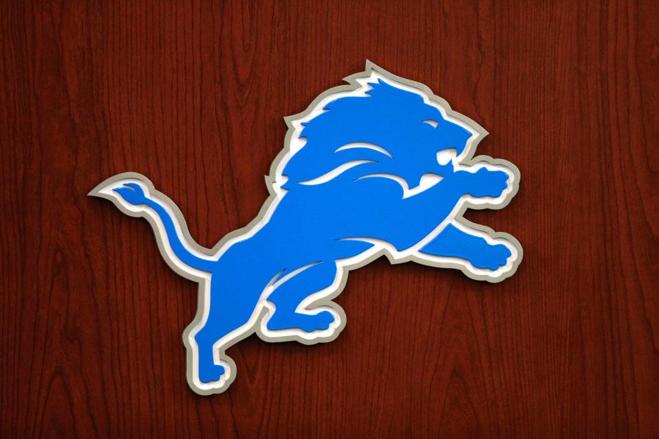
The Lions have been using their namesake as a logo since 1952, depicting the king of the jungle in some way in all of the logos since then. The original logo in the '50s was a man in a football uniform riding on a gold Lion, before it was changed to a white lion with a light blue outline in the middle of two vertical bars of silver and blue. The team switched to a pouncing blue Lion with a white outline in 1970, which remained the logo until 2002, when they added a black outline to it. In 2009, the logo went under another small overhaul, removing the black border and adding fangs, teeth and muscle to the Lion, which is still being used today.
More: How the Detroit Lions got their iconic Honolulu Blue uniforms
The Pistons' original logo was a blue outline of a basketball that said "Detroit Pistons" in red on the inside. In 1978-79, the Pistons updated the look to the outer rim blue and the inner circle red with white markings creating a circle for “Detroit Pistons” to be written in. The Pistons stuck with that until the late '90s, making a drastic change in 1996-97: They switched to a horse head with "Pistons" written diagonally underneath, with the S letters forming two tailpipes under the name, a nod to the auto industry. In 2005-06, the Pistons went back to the basketball design, and in 2017-18 decided to make it look like a modern version of the logo adopted in 1978-79 that became synonymous with the Bad Boys.
Now that the history lesson is done, it's time to choose a favorite. Here is what people are choosing online in response to the post, with the Red Wings and Tigers leading the way in votes.
Redwings of course
— MikeInRVA (@HornInRVA) February 22, 2024
Honestly, even though the Lions are at the top of my chart as far as fandoms right now, as far as logos go, it’s:
1. Wings
2. Tigers,
3. Pistons
4. Lions
That’s not knocking the Lions logo, which I love, but the others are old world iconic. I love tradition 🤷🏻♂️— R. C. (@rcblue3) February 22, 2024
Easily 1) Red Wings
2) Tigers
3) Lions
Wide gap
4) Pistons, glad they went back to the classic logo from the Bad Boy years but still kinda bland— Great Tasting Less Zaching (@G_T_L_Z) February 22, 2024
Hmmm…tough call…going with this 👇😎 pic.twitter.com/7pmKz9ATXc
— J F Johnson (@jfjohnson26) February 21, 2024
The old English D is world renowned
— C HENRY (@CHEN313) February 21, 2024
The Winged Wheel is the best logo in hockey but the English D is the best logo in Detroit. https://t.co/aSZTxopgaC
— Rory Cooper (@rorycooper) February 22, 2024
As iconic as the old English D is, I personally think the redwings logo top 3 logo in all sports. https://t.co/mOWuoNMR4G
— J. Walk (@Jwalk35_) February 22, 2024
I would say Red Wings is the most creative but The Tigers Old English D is just legendary 🔥 https://t.co/DGxxETfRO4
— Boobie🍫 (@ImGoodTho) February 21, 2024
1. Wings
2. Tigers
3. Lions
4. Pistons
Wings is just the best logo overall, the old English D is also iconic, I will probably tattoo the Lion on me someday but it just falls to third here, and Pistons.. yeah anyway
fight me https://t.co/uOQq6wcH0A— Kellie Rowe (@kellierowe) February 22, 2024
Love my Lions but it’s gotta be
1. Red Wings
2a. Lions
2b. Tigers Old English D
4. Pistons :(— Kusch🤙🏾 (@matt_kusch) February 21, 2024
This article originally appeared on Detroit Free Press: Which Detroit sports team has best logo: Tigers, Wings, Lions, Pistons?

