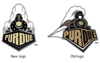
Purdue unveils new logo that’s strikingly similar to its old one
Apparently convinced Purdue's previous logo didn't sell enough t-shirts and caps because of the plume of smoke coming from the train, Nike recommended the school tweak its logo in time for next school year.
Purdue listened to Nike's concerns and came up with the perfect solution: A new train logo with a new plume of smoke!
"It's really a Nike-driven initiative," associate athletics director Tom Schott told the Purdue Exponent. "Nike had come to us a while back with some suggestions. Nike said the train logo we used was not good on apparel. The smoke didn't work on shirts and hats. They recommended this slight revision."
A design expert may disagree, but it's hard to imagine the new logo would sell any better or worse than the old one, right? In fact, considering the similarities between the two, all but the most diehard Purdue fans are unlikely to notice there even is a new logo.
Judging by a Big Ten Network poll, however, the diehards have noticed some differences between the new and the old look — and they aren't happy about them. Not only do 81 percent of Purdue fans polled prefer the old logo, they've taken to the comments section to point out details they dislike.
Ultimately, the real merchandising lesson is this: Winning sells any logo. How else do you explain Wichita State basketball fans still purchasing t-shirts displaying a musclebound wheat man clad in a WSU sweater and chewing on some wheat?


