The new Umbro logo is a powerful tribute to a 100-year legacy in sport
When we think of the best sports logos, certain big global brands often come to mind. Adidas and Nike, in particular, have been dominant forces in many sports in recent years. However, some argue that the iconic British brand outclasses them both.
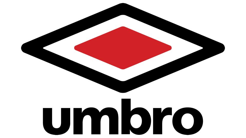
Umbro turns 100 this month – on 23 May, to be precise – and it's marking the occasion with a new centenary logo that celebrates its legacy. It injects a splash of colour while maintaining and emphasising the shape of the existing design.
Founded by the brothers Harold and Wallace Humphreys, Umbro's name is a portmanteau of ‘um’ (from Humphrey) and ‘bro’ (from 'brothers'). It became highly visible in British sport in the 1970s and well into the 1980s as many teams began wearing Umbro kits at a time when Nike was still a firmly US-focused brand associated with basketball and track and field, and it retains a special place in the memories of English football fans today.
For it's anniversary, Umbro has introduced a new logo variant that adds a bold red colour to the central diamond. It captures attention, draws the eye and drips with sporting nostalgia without modifying the shape of the existing logo, which remains in use alongside the centenary design.

Craig Burston is Senior Lecturer in Graphic and Media Design at on the BA (Hons) Graphic and Media Design at London College of Communication, part of University of the Arts London. He thinks that while rivals Nike and Adidas tend to be studied more (the latter also celebrates its centenary this year), the Umbro logo is stronger in pure design terms.
“The Umbro double diamond logo is a beautiful application of simple geometric shapes, rather than Adidas and Nike’s ‘did-you-see-what-we-did-there?’ logos," he says. "While the ‘Nike swoosh’ became a staple logo for anyone studying brand identity, this is arguably more for marketing genius (“Just Do It”) than its actual design."
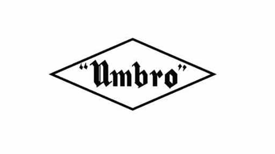
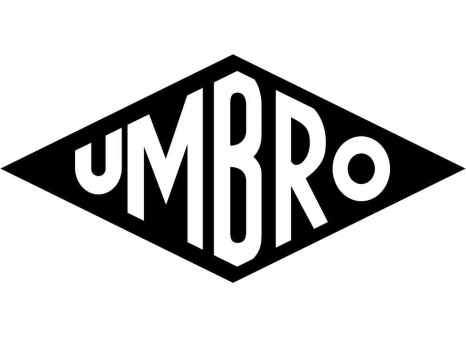
Craig notes that in its earliest incantations, the Umbro logo included the brand's name inside the diamond shape, enabling sportspeople and customers to read, "think", and then remember the name. In 1974, it redesigned the logo to introduce the double diamond we know, boasting a new solidity that no longer required the name inside it.
"Does anything even sound as remotely strong as a ‘double diamond’?, Craig asks. "The alliteration of description of the shape and form of the logo is even stronger than the portmanteau of Umbro the company name."
Like the Deutsche Bank logo, which has just turned 50, Umbro's mark demonstrates the power of simplicity and alliteration in logo design. "Something as simple and dynamic as a diamond goes a long way to representing all that is great about team sport – strength through dynamic form," Craig notes. It also shows us that radical change is often not necessary, and that credibility can grow over time
For Craig, part of the enduring strength of Umbro's branding is that it hasn't been tempted to change its identity "for its own sake". It made a few tweaks over the years, squishing the diamond shape for a period, but the central architecture had remained the same. That's helped the brand maintain a low level of cool, including among vintage sports clothes collectors. "While brands like Adidas and Nike became the leaders in designing sub-brands through the adoption and adaptation of symbol sets and systems, Umbro is and only ever was the diamonds," Craig says.

