Timeless or too bland? FIFA unveils 2026 World Cup branding, and reactions are mixed
FIFA unveiled its branding for the 2026 World Cup, which will be held in the United States, Mexico and Canada.
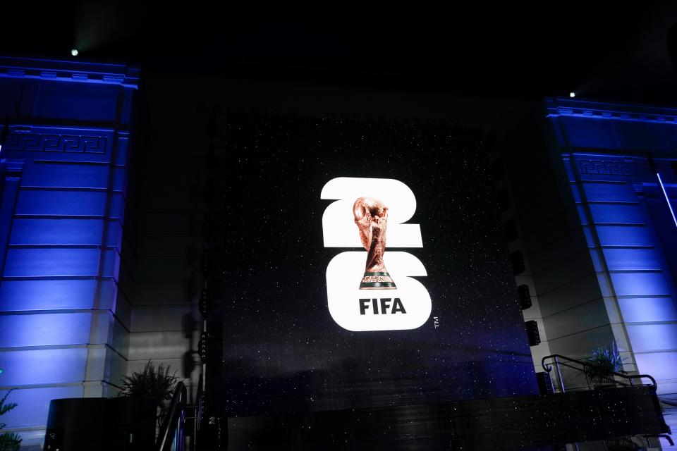
The brand was launched Wednesday night at the Griffith Observatory, with several of soccer's biggest stars and legends in attendance. The logo includes an image of the World Cup trophy for the first time, with the numbers "2" and "6" stacked on each other in the background. As part of the launch, FIFA also announced the "We Are 26" campaign.
Reactions to the branding have been mixed, with some fans on social media labeling it "too bland" and FIFA calling it "timeless."
What does the 2026 World Cup branding mean?
FIFA described the branding as a "timeless approach" to the global tournament that forms "an innovated design."
"The image of the trophy and the year allow for customization to reflect the uniqueness of each host, while building an identifiable brand structure for years to come," FIFA said.
Each logo for the 16 host cities in the U.S., Mexico and Canada have different colors and references to the city in the "We Are 26" campaign. For example, Kansas City's logo is red and blue, and the "We Are Kansas City" wording includes a reference to its nickname as the "City of Fountains."
What is FIFA saying about the 2026 World Cup logo?
FIFA President Gianni Infantino said the "We Are 26" slogan is a "rallying cry."
"It's a moment when three countries and an entire continent collectively say: 'We are united as one to welcome the world and deliver the biggest, best and most inclusive FIFA World Cup ever," Infantino said.
Concacaf President Victor Montagliani told reporters ahead of the launch he was excited about the branding.
"Obviously, the cities are really excited, really behind it," Montagliani said. "Now they'll get to sort of get their feathers going with the colors and all that kind of stuff."
Reactions are mixed
Many social media users weren't in love with the brand, noting it seemed too simple and bland.
It should have been something that would represent the 3 countries. Come on guys
— Rodoval (@RoDoVaL) May 18, 2023
The logo is soo basic and I hated it, it should’ve been more detailed
— Sergio Parra (@SwagLegend_) May 18, 2023
This is… pathetic 😐
— Anjoe Anthonysamy (@KCSocWiz) May 18, 2023
The most lame, bland logo you could have possibly come up with. Where is the character??? pic.twitter.com/59mce25Po3
— Sam Hays (@WichitaChiefSam) May 18, 2023
Bruh...even the bid logo looks better than this. At least it has colors. pic.twitter.com/Q7X5gDVTB5
— subtempest04 (@subtempest04) May 18, 2023
So you’re telling me that the USA, Canada, and Mexico are all hosting the next World Cup together and this is the best logo they could come up with???????? pic.twitter.com/ZXVoKg8vnP https://t.co/YmotOG8TuD
— Matt³³⁺¹⁶ (@FM1_3316) May 18, 2023
This a way better logo for the 2026 world cup, why have they not gone with this? pic.twitter.com/sOBJwD5dea
— Football Report (@FootballReprt) May 18, 2023
FIFA: “I want a World Cup logo that’s done in Microsoft Paint in less than 5 minutes”
Designer: “Say no more” https://t.co/lOQzAG4TKD— Kyle Bonn (@the_bonnfire) May 18, 2023
This article originally appeared on USA TODAY: FIFA unveils 2026 World Cup logo, branding to mixed reviews

