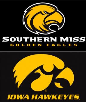
Iowa’s logo beats Southern Miss’ head-to-head in federal court

Attention Mississippi retailers: It might be time to start marking some of that Southern Miss gear down. If the University of Iowa gets its way, USM's current Golden Eagle logo may soon be a thing of the past, and thanks to a pair of judges in Washington, D.C., it looks like Iowa is going to get its way:
HATTIESBURG — The Golden Eagle logo unveiled by Southern Miss nearly nine years ago might be in jeopardy because University of Iowa officials say it's too similar to their Tiger Hawk emblem — and a three-judge panel agrees.
USM's trademark application was denied last week by judges in the United States Patent and Trademark Office, who ruled 2-1 in favor of Iowa.
The ruling has left USM's attorneys scouring the 54-page decision.
[…]
Administrative trademark judge David Bucher wrote in his majority opinion that he backed Iowa's claim that there would be "the likelihood of confusion" in merchandise sales between the schools. … "The overall similarity in appearance of the marks on the goods, particularly in light of the use of identical color schemes, creates virtually identical commercial impressions."
Predictably, Southern Miss disagrees, arguing that Iowa's 'Tiger Hawk' brand is merely "a collection of four separate silhouette shapes put together in close proximity creating a two dimensional image that is then displayed against backgrounds of changing colors," and "has the simplicity of a stenciled or stamped image." You know, kid's stuff. Whereas the USM eagle head is more complex, featuring the "fierce eyed gaze of independence" and creating a "symbol of courage and power, reminiscent of Roman soldiers ... going into battle [with] a crimson banner with a golden eagle emblazoned on the banner." Southern Miss still has the option of presenting that argument to the Court of Appeals for the Federal Circuit in Washington, D.C., if it can do it with a straight face.
Full disclosure: I was near the end of my undergraduate tenure at Southern Miss when the new logo was introduced in 2003, and my first thought at the time was "That's too similar to Iowa's logo." Not in a legal sense — I'm a fake doctor, not an intellectual property lawyer — nor for fear that any sentient person with the slightest hint of interest in either school might actually confuse the two. No, only in the sense that I wasn't thrilled about having my alma mater being represented by yet another of the many, many, many angry bird heads already on the market, every single of them following the same streamlined, cartoony template. It has always looked like something any graphic designer would pull out of a clip file titled "Generic 'Eagle' Logos Circa 2003," and frankly anything that brings us one step closer to resurrecting the much cooler "Attack Eagle" logo of the nineties is a positive development.
While they're at it, maybe they can bring back the "old" gold instead of the yellow "gold" in the color scheme, too. And the old potbellied, cross-eyed mascot with the unibrow. And whatever else they have to do to make everything exactly like it was in the specific years I attended. "Progress" is overrated when you're already doing right.
- - -
Matt Hinton is on Twitter: Follow him @DrSaturday.

