Can you spot it? 15 corporate logos with hidden meanings

What do you see?
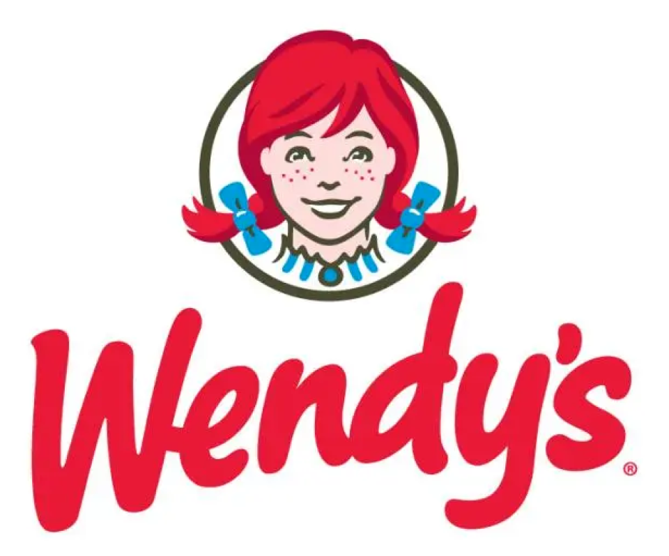
Look. And then, look again. Once more? Although Wendy’s denied that it was a purposeful move, fans of the fast food franchise caught on that the word “MOM” had been designed into the collar. It’s one of many corporate logos with hidden elements, most done with intent.
Check out the ones below and see if you can spot the hidden elements…
15. Toyota
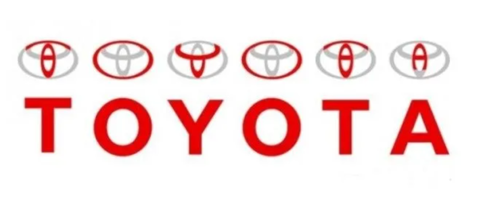
Look closely: You can see every letter in the word ‘Toyota” by looking at its logo
14. Baskin Robbins
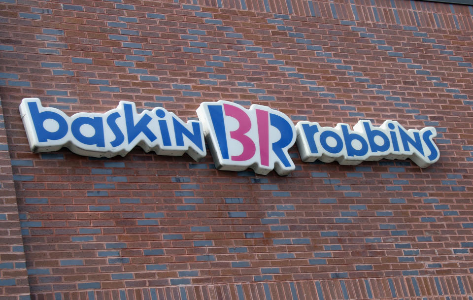
31 flavors, indeed. Says it right there in the logo.
13. Museum of London

A little geography lesson with this one: Each shape in the logo represents the different boundaries of London throughout its history.
12. FedEx
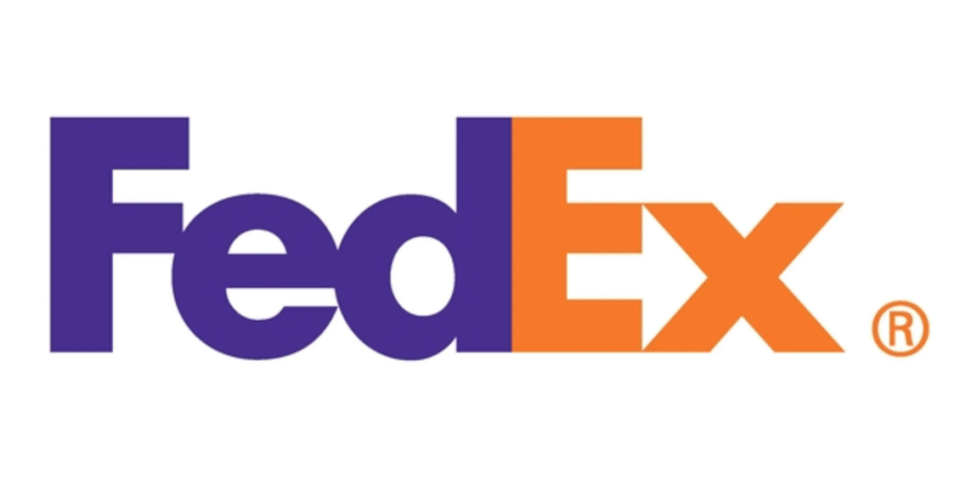
The white arrow between the ‘E’ and ‘X’ has become an all-time hidden logo classic.
11. Amazon

The hidden element in the Amazon logo seems to be expanding daily: The online company sells everything “from a to z” and delivers it with a smile.
10. Toblerone
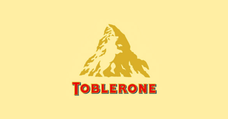
This one is fun, and really not that well known: The Swiss chocolate bar is made in Bern, Switzerland, also known as the “City of Bears.”
9. Continental

Don’t let your eye drive past the first letter too quickly: See the ‘C’ and ‘O’ forming a tire?
8. Hope for Africa Children Initiative
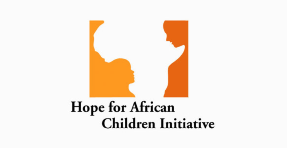
While the outline isn’t a spot-on schematic of the African continent, it’s pretty cool how the subtle change creates and image of an adult looking at a child.
7. Bronx Zoo
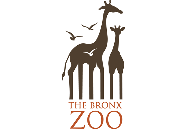
Another classic! Take a close look at the giraffes’ legs — see the cityscape?
6. The Guild of Food Writers
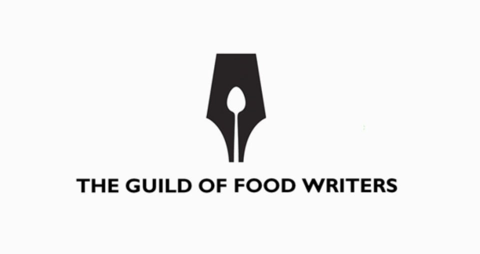
Do you see the spoon or the pen? Or both?
5. Yoga Australia
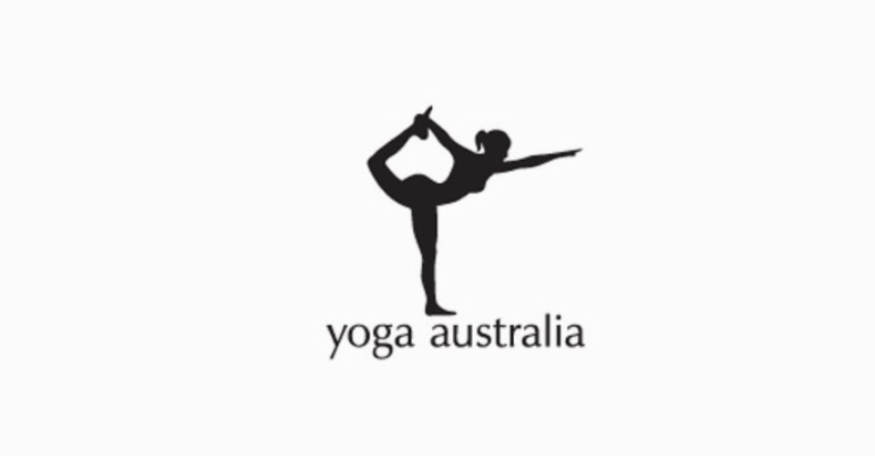
Another solid use of outlining, this time with the Australian continent in the formation of the woman’s pose.
4. LionBird
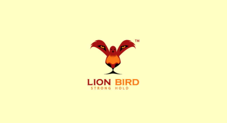
One of our all-time favorites. LionBird may be unfamiliar to those outside of the start-up biz world … but the logo is combo art at its finest.
3. 90 percent
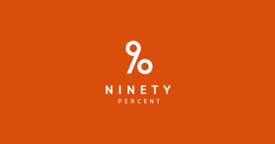
Stretch the numbers and you have the charitable womenswear’s logo name in one element.
2. NBC
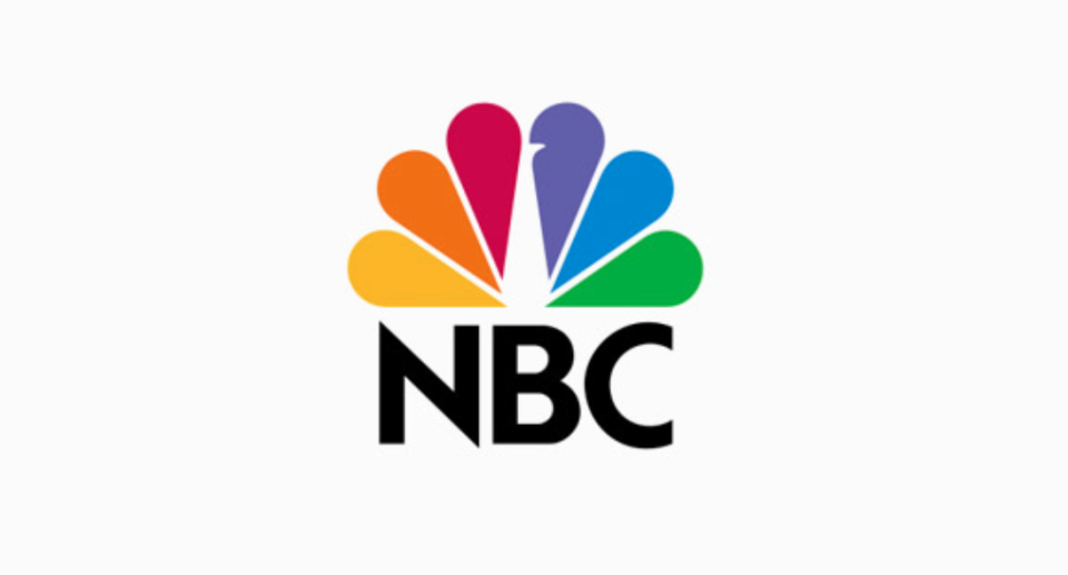
There are classics, and then, there is the NBC logo: The feathers of the peacock represented the six divisions of the network when it was designed: news, entertainment, sports, network, productions, and stations.
1. Cisco
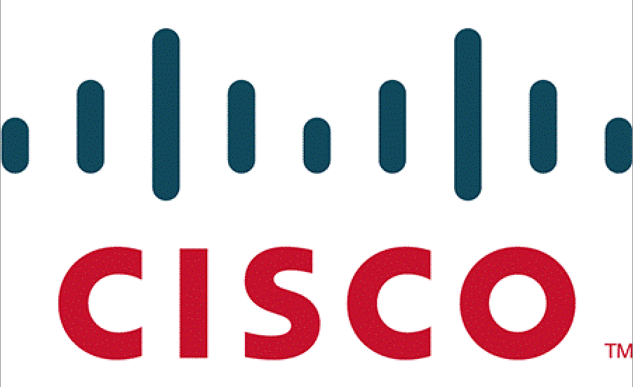
Bay Area folks should get this one — for others, take a close look and you’ll see the homage to the Bay Bridge.
Sweet Bonus: Hershey's
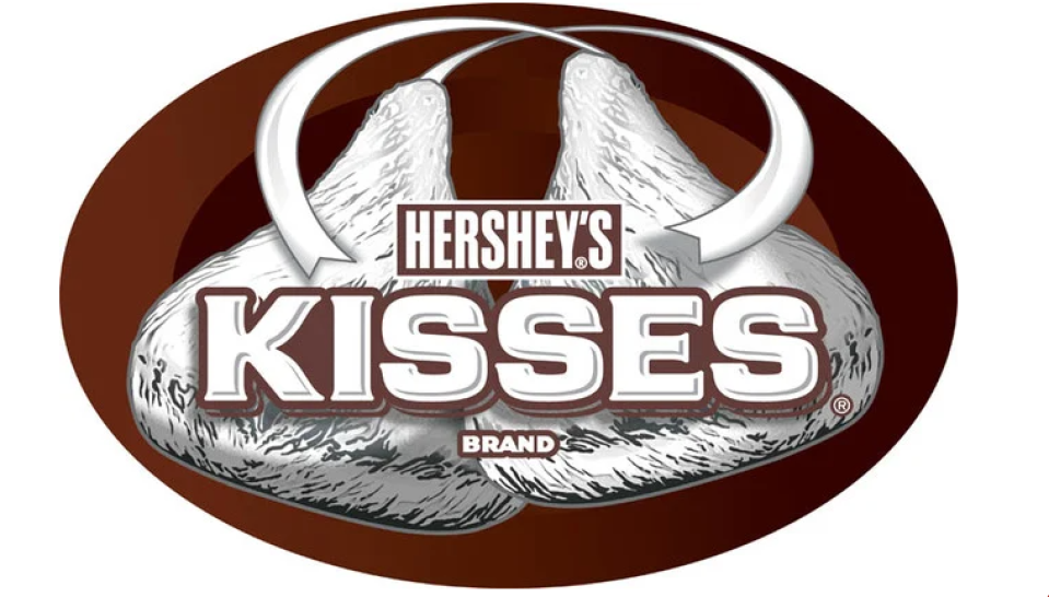
There’s always room for chocolate! See the space between the “K” and “I”—it’s an unwrapped Kiss turned on its side.

