Ranking every NBA special edition in-season tournament court

The inaugural NBA In-Season Tournament is coming in November, and the league just revealed 30 alternate court designs that will be used in group play and the quarterfinals of the event.
For all games in those rounds, teams will be playing on fully painted courts with no wood grain visible, with a 16-foot-wide “runway” stripe in the middle of the court from end to end. Each court features the NBA Cup trophy at center court.
NBA teams took those design details and delivered vibrant, colorful court designs – but while some teams can be proud of an awesome new look, other designs missed the mark.
We ranked every NBA in-season tournament court. Let’s start with the worst of the bunch and work our way through to the best.
30. New Orleans

You can’t say the Pelicans didn’t swing for the fences here. Spooky skele-Pelican and a color scheme only the Joker could love.
29. Atlanta
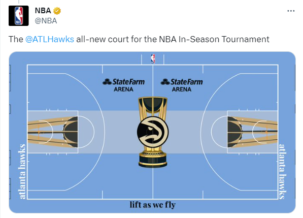
This feels like someone forgot to design the court until there were 5 minutes left before the deadline. What are we doing here with light blue, Atlanta?
28. Golden State

Is this supposed to be a stealth UPS ad?
27. Brooklyn
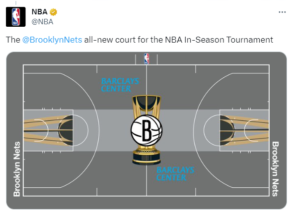
The Nets already have a grey court, so this is just more of the same. Unoffensive but lacking inspiration here.
26. San Antonio

At first, second and third glance I was sure the Sonics had returned to the NBA
25. Milwaukee

I’m deducting points here because the massive fiserv.forum logos overshadow the Bucks’ own logo at midcourt.
24. Sacramento
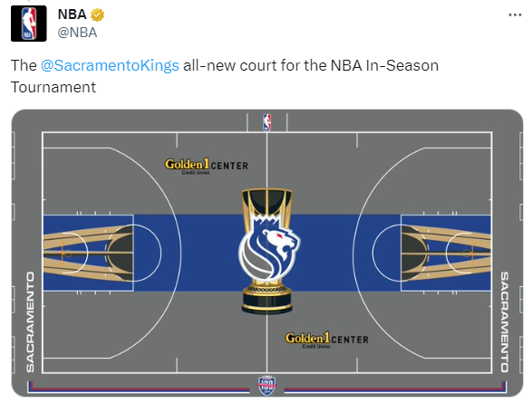
It’s not horrible, but this is a pretty significant downgrade from the Kings’ standard court design, which is great.
23. Washington

The midcourt logo is great, but the predominantly grey court ruins the look. Change the grey to black and we’ve got a winner here.
22. Chicago
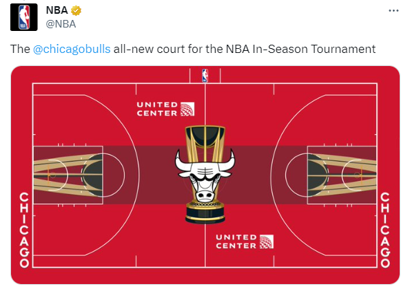
The wine-colored center stripe ruins this one.
21. Indianapolis

The logo is a little too “rad early 90s skateboarder,” but you can’t really go wrong with UCLA colors on a basketball court.
20. Miami
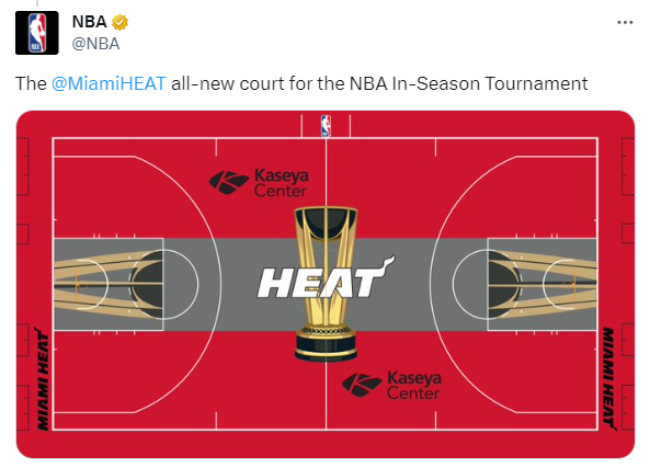
Considering Miami gave us the excellent Vice edition jerseys and courts over the years, this feels a little boring.
19. New York
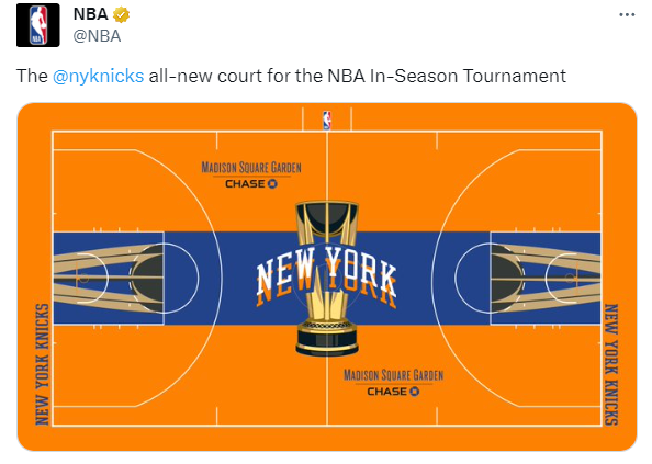
The more I look at the center logo, the more my eyes are trying to unfocus in order to figure out a 3D puzzle.
18. Minnesota

Perhaps the least offensive, safest design in the league… but it just doesn’t really feel Timberwolves-y enough. Give me some green in here, Minnesota.
17. Denver
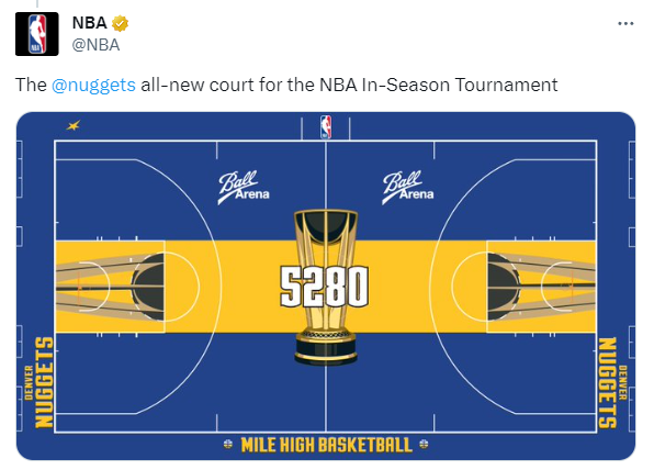
This is all the Warriors had to do!
I would have preferred to see a version of the Colorado Rockies’ green license plate look on the court, but this is… fine.
16. Oklahoma City

Credit to OKC for not making orange the predominant color, which would have made this much harder to look at.
15. Toronto
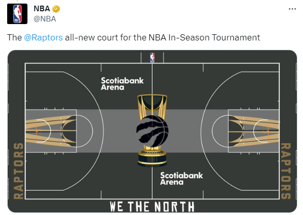
Strong OVO logo vibes here.
14. Cleveland

I’m not sure the Cavs understood the assignment, as they’ve created what appears to be a fairly standard basketball court. Still, it works.
13. Los Angeles Lakers

Yep… that sure does look like a Lakers court. Let’s move on.
12. Philadelphia
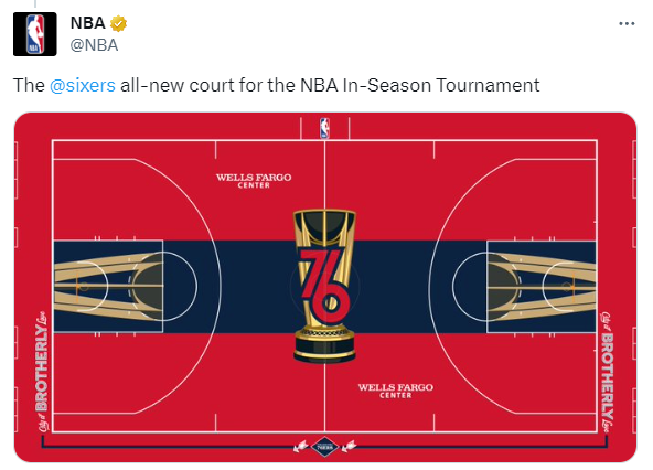
Simple and clean. Nothing to complain about here.
11. Houston
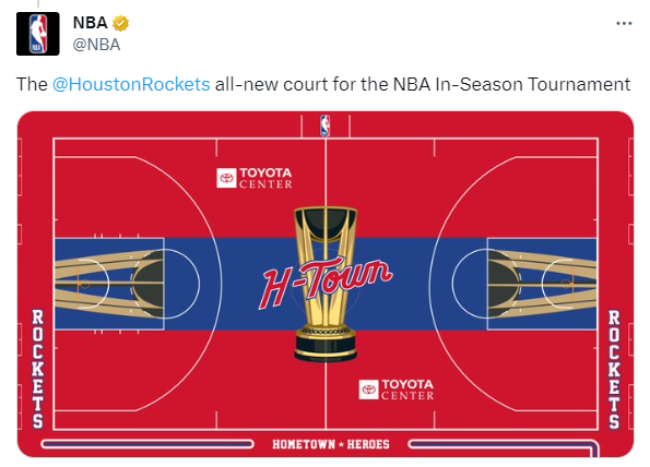
We’re not far off of the Sixers’ court here, so let’s lump them together.
10. Los Angeles Clippers

The shaky, hand-drawn looking center court logo…. somehow ties all this together. I don’t dislike it.
9. Memphis
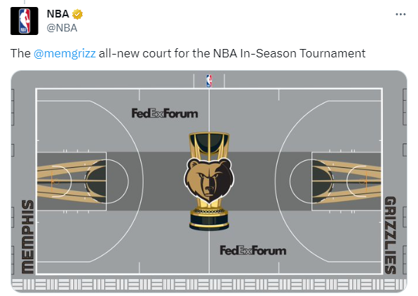
Re-shading the Grizzly logo gold to match all the other accents was a nice touch.
8. Charlotte
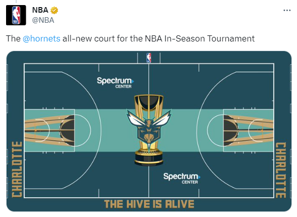
A bold color scheme that isn’t over the top.
7. Dallas

We could use some more contrasting colors here, but the Mavs logo makes up for a lot.
6. Phoenix
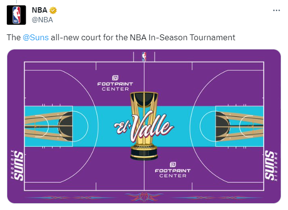
This is how you do a purple court, New Orleans.
5. Orlando

The Orlando… Cowboys? This (unintentional?) Dallas mashup really works.
4. Detroit

And with another mashup, we have the Detroit… Raptors? This might be slightly out of place for the Pistons as there’s no blue to be seen, but it’s awesome regardless.
3. Boston

This has to be top-3 just for the Boston logo alone. It’s beautiful.
2. Portland
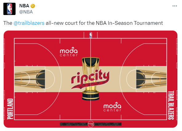
Going with a standard court color in the center helps the design significantly and is a move more teams should have made to avoid courts that look too busy. The plaid center court logo is magnificent.
1. Utah
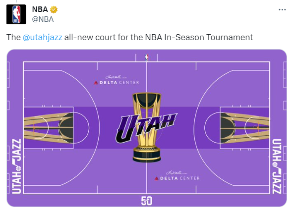
Near perfect. We just need some mountains in the background along the center stripe to take this design to another level.

