Exclusive: Unveiling the Mets’ full City Connect uniforms, and telling the story behind the designs
The Mets will unveil their City Connect uniforms today, then wear them for the first of many times during their Saturday, April 27 game against the St. Louis Cardinals. For those of us who take a particular interest in the aesthetics of the game, the addition of a new uniform to a team’s rotation is a significant event.
A few images appeared online last week. But those leaks offered few up-close details, and none of the story that explains them.
Here we present new images and the concepts behind those designs.
“The true essence of what City Connect means is connecting to the city,” says Mets chief marketing officer Andy Goldberg. “And part of how we did that was through the connections Mets fans have throughout the city. The elements of the jersey tie into the whole connection idea, if you will.”
Those elements do indeed hew to the theme of connection — in many instances, how transportation connects people to one another throughout the disparate locations within New York.
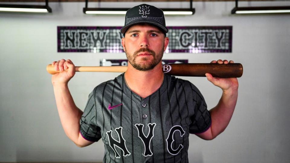
• The dark gray of the jerseys — which feature “NYC” in big lettering on the front — represent the concrete that makes up the city’s sidewalks.
• The pinstripes on the jersey are, of course, a nod to the Mets’ pinstripes — but, on closer inspection, are composed of circles and diamonds. These represent the express and local trains of the New York City subway system.
• The circular sleeve patch is a take on the classic New York City subway token.
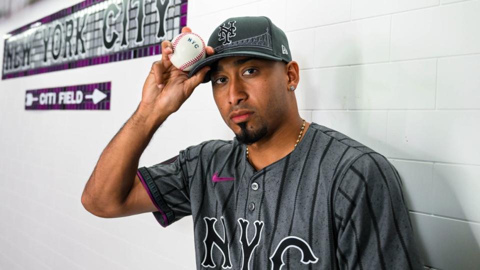
• The purple on the hat’s button, the jersey and the piping of the white pants is a reference to the 7 Line.
• An image of the Queensboro Bridge is stitched into the hat, under the interlocking NY. The bridge appears more subtly on the pants and sleeves as a cross section image.
• The sweatband inside the hat includes a multicolored take on the NYC subway map.
• The back of the jersey uses the team’s classic road font in the player’s name and number.
For Mets personnel, today’s unveiling represents the culmination of several years’ work. Goldberg calls the collaboration between Mets staffers — a group that includes himself, executive director of consumer products James Benesh, and many others — and Nike a “true labor of love,” and said that the project was already in motion by the time the team hired him in 2022.
“We wanted it to capture the true essence of New York in a way that wherever you go in the world, if you're wearing this jersey or a piece of swag from our City Connect story, it's identifiable with the Mets,” Goldberg says.
During the design process, team stalwarts Francisco Lindor and Brandon Nimmo offered feedback. Lindor, long admired by owner Steve Cohen for his sense of personal style, became particularly involved.
The April 27 debut will be a full-scale event at Citi Field, which will host what Goldberg calls a “City Connect takeover.”
Details ranging from scoreboard features to menu boards to the name placards in the locker room will be City Connect themed. The bases and balls will also be stamped with the stylized “NYC.”
From there, the Mets will wear their City Connects during every Saturday home game for the rest of the season, save for June 1, when the team will retire Darryl Strawberry’s No. 18.
It’s at the players’ discretion if they want to add more games with the City Connects. A few informal clubhouse conversations this week indicated that players liked the unis, and would choose to wear them more often than the scheduled Saturdays.
Typically, but not always, the starting pitcher makes the uniform decision on a given day.
A few thoughts:
Perhaps because I’m the type of person who talks and tweets too much about baseball uniforms, the Mets offered me an in-person peek this week at their City Connects.
My (naturally subjective) verdict: the team and its partners at Nike have come up with a look that works on both a visceral and conceptual level.
In an MLB season defined by widely panned uniform changes, these are, simply put, nice to look at. Their debut will bring a burst of much-needed good news during an aesthetic down period for the sport, in which sweat stains, small names, and see-through pants have dominated discussion of apparel.
The gray tops and white pants with purple accents avoid potentially cringy City Connect traps like overly bold colors and monochromatic jerseys and pants.
The lettering on the back provides an antidote to the problem of undersized names that has emerged this year. That was caused by the decision to move the MLB logo down from the collar, where it occupies some of the space in which names once appeared.
The names on the Mets’ City Connect jerseys are the same height as on their typical 2024 uniforms. But because the road font is wide, those names appear larger and are easier to read — they are closer, then, to how big league names should pop on the back of a uniform.
Perhaps this can point a way forward league-wide as a workaround to the small-name problem.
The upshot: The Mets’ City Connects are different without being garish, edgy without trying too hard. It’s easy to imagine New Yorkers wanting to walk the streets wearing the hat and especially the jersey.
If players and fans react to these uniforms the way I did, they could move into a lasting place in the team’s rotation.


