
Georgia introduces a rebranding project so subtle, you have to read this to notice

Georgia has changed its uniforms and branding, but not enough that you would really notice.
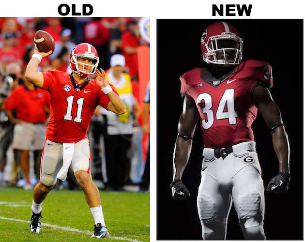
The university announced today that it was making changes to its football uniforms and tweaking its secondary logo as part of its rebranding process. However, since Georgia has one of the most solid and iconic uniform looks in college football, the only changes are to the jersey number and the typeface and small modifications on the pants.
Yep, that’s it. Georgia is officially rebranded.
Georgia will keep its “Power G” as it’s main logo and add a bulldog with a spiky collar as it’s secondary logo. Again, nothing too crazy to see here.

I do like Georgia and Nike’s approach because why mess with a good thing? People identify with Georgia’s red jerseys, silver pants and helmet with the “Power G” logo on it. Why mess with it if it already works?
What do you think? Was Georgia right not to get too flashy with new uniforms?
- - -
Want to join the conversation? Hit us up on Twitter @YahooDrSaturday and be sure to "Like" Dr. Saturday on Facebook for football conversations and stuff you won't see on the blog.
Memorable Moments from Yahoo! Sports:
Other popular content on Yahoo! Sports:
• Ex-Ohio State star Maurice Clarett attempts comeback, but not in football
• Near-death experience didn't deter Oregon's Dion Jordan from NFL dream
• Miami Heat won't be fined for sitting stars
• Kevin Ware's injury not the worst adversity Rick Pitino had to handle
