Ranking Big Ten college football helmets from worst to best

We’ve already ranked the stadium experiences as well as the uniforms in the Big Ten — now it’s time to get to another sartorial item that teams are known by: their helmets.
As much as the uniforms tend to garner attention, the helmet is another entity altogether. Some teams — like Michigan or Nebraska — use the helmet itself as a brand. You might see a block M on a Wolverines polo or you could see the winged helmet.
However, some teams constantly change helmets depending on the game. While it works fine for some teams, for others, it’s because they don’t have as recognizable of a brand.
So, with that in mind, here is my ranking for the Big Ten college football helmets, going from the worst to the best.
List
247Sports' Steve Lorenz shares 10 Michigan football recruiting targets to watch

Illinois Fighting Illini

Photo: Stan Szeto-USA TODAY Sports
As I wrote about the Illinois uniforms, the Illini just currently don't have a consistent brand or identity. There's nothing ugly about their helmets, but they trot out a new look every week -- sometimes white, sometimes orange, sometimes blue, all with a boring block I. Honestly, Illinois was better off when it used to wear the orange helmets with the school name underlined, reminiscent of what the New York Giants used to wear. Like with their uniforms, the lack of consistency and cohesiveness earn the Illini at the bottom of our list.
Northwestern Wildcats
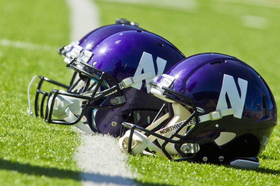
(AP Photo/Tony Ding)
While the Northwestern uniforms are sharp, the helmets have always bothered me. I get that it's a cross between an N and a W in a way, but stylistically, it's always just looked ugly to me -- like some kind of postmodernist design that hasn't held up. The Wildcats have a few alternates, including black helmets and dark purple with a mascot on the side. Honestly, the latter would be better than the traditional we've seen most of the time.
Maryland Terrapins

Photo: Rich Barnes-USA TODAY Sports
They're bold, you have to give them that. I go back and forth on whether or not I like Maryland's helmets. They do look like an overdone motorcycle helmet to some degree, especially with the graffit-esque gradient in the word Maryland. While I understand it's the state flag, having the flag ripples is just a touch too much for me. Ultimately, while I don't hate these as much as many do, they're just too busy overall to be above any of the other teams.
Rutgers Scarlet Knights

Photo: Denny Medley-USA TODAY Sports
There's nothing wrong with these helmets, but just like pretty much everything with Rutgers, they're boring. The block R is boring and putting it on plain white or red is boring. They're inoffensive, but lacking finesse. Again, fine, but -- boring.
Purdue Boilermakers

Photo: Jeff Hanisch-USA TODAY Sports
Purdue's helmets are fine, and I like that they're a shade darker than the pre-gloss Notre Dame helmets. They have a classic look but it could use a little more panache. It's not as boring as the Rutgers helmet, but it's also nothing to particularly write home about.
Indiana Hoosiers

Photo: Marc Lebryk-USA TODAY Sports
Indiana has a few variations and has actually gone to a more matte look, but the IU logo does all the work. Yes, there are other styles, including a script Indiana, but the best of all is the traditional one.

Photo: Jesse Johnson-USA TODAY Sports
Minnesota probably deserves to be higher on this list, because the helmets somehow feel modern, despite using the traditional old look. They have several variations: traditional maroon, yellow, white and a Notre Dame golden domer-style. They're all very sharp, but they get dinged by having too many options (while not being Oregon). Nonetheless, it's a stylish look.
Michigan State Spartans

Photo: Mike Carter-USA TODAY Sports
MSU is another school that's had a lot of variations as of late as the program departed from more of an emerald green to a darker, forest color. Honestly, most of them are quite stylish -- though I'm not a fan of the neon nor the golden helmets used in 2011. The Spartans traditional look is very good now though, and the block S alternates are nice, too. But if MSU went with either the white helmet with the Spartan insignia or the one with gruff Sparty, then these would be much, much higher on this list, because both of those are stellar.
Iowa Hawkeyes

Photo: Jeff Hanisch-USA TODAY Sports
Now we're getting into the teams that rarely, if ever, do variations -- because they don't have to. Iowa's look is classic and recognizable and it screams old school, smash mouth football. There really isn't anything I'd change about the Hawkeyes helmets because they're precisely what they should be.
Wisconsin Badgers

Photo: Jeff Hanisch-USA TODAY Sports
Wisconsin is another school that doesn't change their helmets because they don't need to. While the white of the helmet is plain, the style of the W logo does all the heavy lifting. And, honestly, there's no reason for alternates. It's an easily recognizable emblem and you know precisely what team you're seeing the moment you see this helmet.
Nebraska Cornhuskers

Photo: Jeff Hanisch-USA TODAY Sports
I thought about putting Nebraska higher, but the others are just better overall. While I know my compatriots at BuckeyesWire aren't as high on what the Huskers do here, I love it. It's overly simplistic, but I love that about it. I'll always recall being young and watching Tommy Frazier donning this simple style and being enthralled. There's no reason to modernize or change. Nebraska could easily rebrand, but that would take away from the old school, traditional feel that these helmets evoke.
Ohio State Buckeyes

Photo: Joe Maiorana-USA TODAY Sports
To some degree, I think Ohio State's helmet could be one spot higher, but I have a soft spot for the helmet that's above it. I did have it one spot lower, but the Buckeye leaves put it over the top. Let's face facts: as simple as the silver bullet look might be, it does strike fear into the heart of the opponent -- though OSU loved wearing alternate looks against Michigan for years. As long as the variation is based on the main theme, that's fine. But this is one that shouldn't change for any reason, because it's already perfect, as simple as it might be.
Penn State Nittany Lions

Photo: Rich Barnes-USA TODAY Sports
Penn State's helmet is an annal in simplicity and why classics never die. It doesn't matter how basic the design of the Nittany Lions helmet is, it's still somehow easily recognizable -- just like the PSU uniforms. Honestly, these are perfection. And if it wasn't for one other helmet on this list, it would be at the top.
Michigan Wolverines

Photo: Jasen Vinlove-USA TODAY Sports
You don't even have to be biased to rank Michigan's winged helmets up at the very top. There is no more recognizable helmet in all of football. Michigan's only changes throughout the years have been the on-and-off again numbers on the sides (which I didn't like), bringing helmet stickers back (which I do like), and going with a matte look (which I also like). The Wolverines never trot out any kind of alternates with inverted colors or anything like that. There have been minimal changes to keep with the times or to throwback to tradition, and there's no reason to go outside of the box here.
1
1
1
1
1
1

