Ranking all 18 Big Ten helmets from worst to first after West Coast additions

Helmets. They are seen as the symbol of a college football team. You have throwback lids that hearken to yesteryear, new age ones worn with alternate jerseys and refurbished ones that try to rebrand a program in need of it.
Many teams in the Big Ten have iconic helmets that stand the test of time, while others could use a little more work than just slapping a logo on both sides.
We decided to poll an array of people from — um, our site here — to rank the best helmets in the Big Ten. We did it before, but now that we have the additions of Oregon, UCLA, USC, and Washington from the West Coast, it’s time to go through that exercise once again.
Of course, opinions vary, and of course we might be homers here with an Ohio State slant, but we’ll try to be as objective as possible.
Also, we’re going with the traditional helmet here, not any of the alternate stuff. We like all of that, but none of those are symbols of the programs.
Here’s a look at ranking the headgear of football teams in the conference that loves tradition, the Big Ten. We’ll go from worst to first. Don’t shoot the messenger, just get on board with what he’s selling.
Rutgers Scarlet Knights

Why the Ranking
Like most programs, we’ve seen other versions of the Rutgers helmet. There’s been classic white, and a silver one at times. However, this is the look we’ve gotten used to and it is about as non-descript as can be. Red with the letter “R.” There’s not much of a winning tradition to hang your hat on in Piscataway, so why not overhaul this lid? Can we at least get a stripe somewhere? Anywhere?
Maryland Terrapins
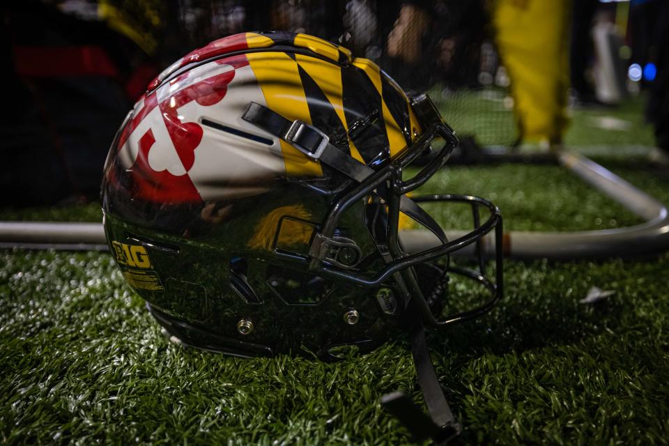
Why the Ranking
Well, what do we have here? You’re guess is as good as mine. It’s like the shows “Inkmaster” and “Design Star” had a renegade child. Sometimes you can outthink yourself, and I fear that’s exactly what happened here. I know what the decision-makers on these sorts of things are going for here, but it has just never worked, not even with time. One thing we know; Maryland folks sure do love their state flat.
USC Trojans
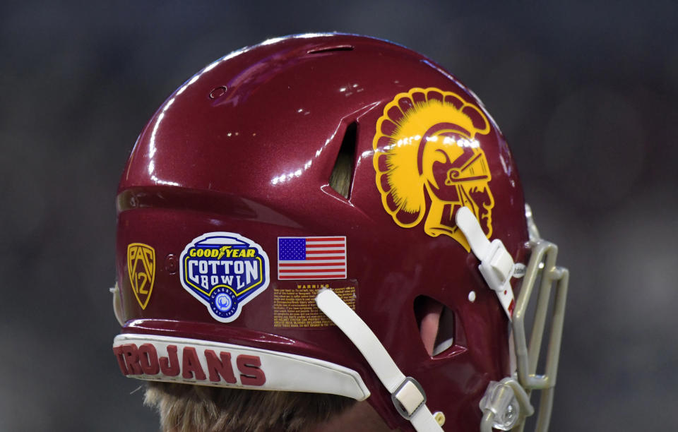
Why the Ranking
Any Ohio State fan has respect for this helmet with as many times the Trojans and Buckeyes have met up. However, take that aside and this is honestly a pretty bland helmet in need of an update. I know there is tradition and all of that, blah, blah, blah — but at least update the logo on the side because it’s been about the same since the we put a man on the moon. It looks like someone got a screen press out and cooked up a basic design.
Penn State Nittany Lions
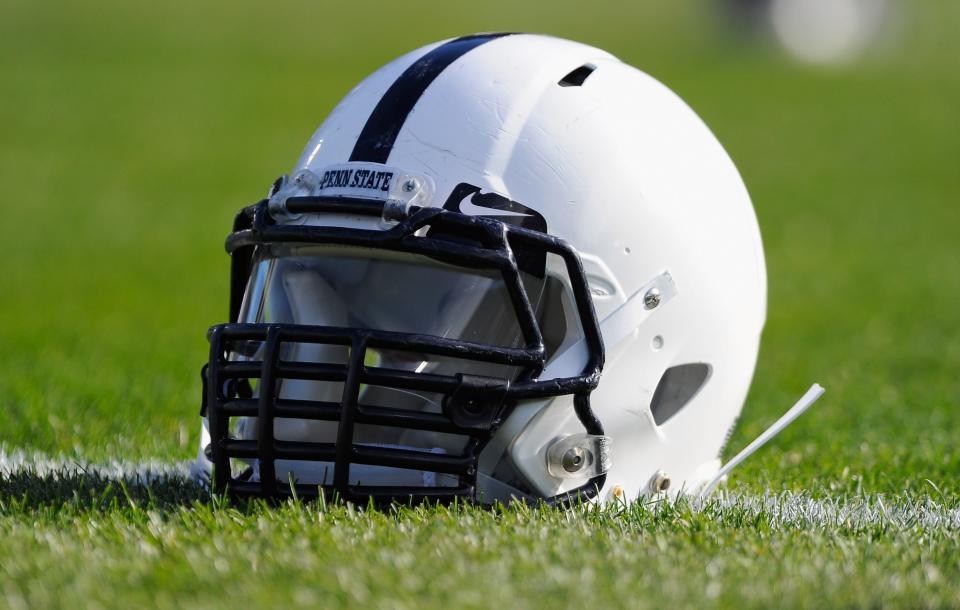
Why the Ranking
I know I’m going to get nastygrams from the purists out there, but c’mon. If I hear those plain blue and white Penn State helmets with one stripe down the middle is iconic one more time, I’ll give you my black and white television set to replace your Smart TV with high definition and surround sound. No? That’s what I thought. If it weren’t for tradition, this helmet would be dead last. You literally can’t design anything with less to it unless you take the stripe off. It’s like they forgot to finish the design here or ran out of time and had to run on the field with something — anything.
Nebraska Cornhuskers
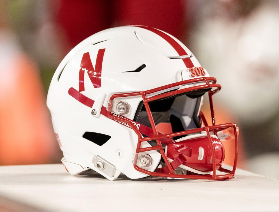
Why the Ranking
Hey, I have an idea. Let’s make a red “N” but make it look like three pieces of tape stuck together. We won’t add anything else to it. Not an outline, and certainly not a logo. Also, let’s keep the lettering as slim as possible, slap it on the side of a helmet and top it off with the obligatory stripe down the middle that’s exactly the same width as the lettering. Pure gold. On the positive spin of things, maybe Nebraska could go out and get a Netflix sponsorship here with how similar the logos are.
Illinois Fighting Illini
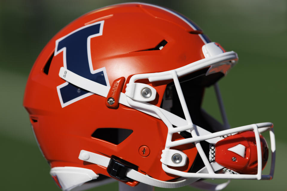
Why the Ranking
I have to admit, it’s hard to find the standard issue helmet for Illinois any longer. The Illini have been alternating between white, orange, and a matted blue base over the last few years. Under Bret Bielema, the orange one is the one that seems to have replaced the one that got creative by stamping the word — stay with me here — “Illinois” on the side of the helmet. It’s a clean look but doesn’t have any pop. We’ll give the program credit for trying to make orange look somewhat palatable.
Indiana Hoosiers
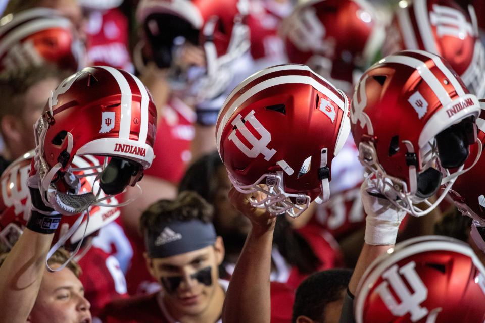
Why the Ranking
Somewhere along the line, the folks at Indiana decided to think outside the box and put two stripes down the middle of the helmet for a drastic change. That’s about as Indiana as you can get, I guess. At least someone tried to put an I and U together in a crazy, pitchforky kind of way for the logo. Or is that a candelabra — it’s hard to tell.
Purdue Boilermakers
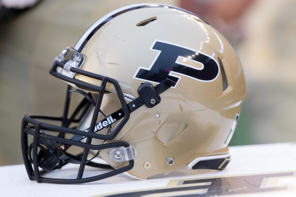
Why the Ranking
I know Purdue likes to bust out the helmets with the railroad tracks down the middle, but that’s not what we’re judging here. Instead, it’s the traditional one. Stripes down the middle? Check. Letter on the side with a slight slant and outline. Check. Different color face mask than the helmet body? Check … again. This helmet checks all the boxes of how to make a boring helmet design, and that’s about it. At least the Boilers didn’t screw anything up with it, so we’ll count that in the win column. Conservatism is the name of the game here, so middle of the pack is where it’s at.
Washington Huskies
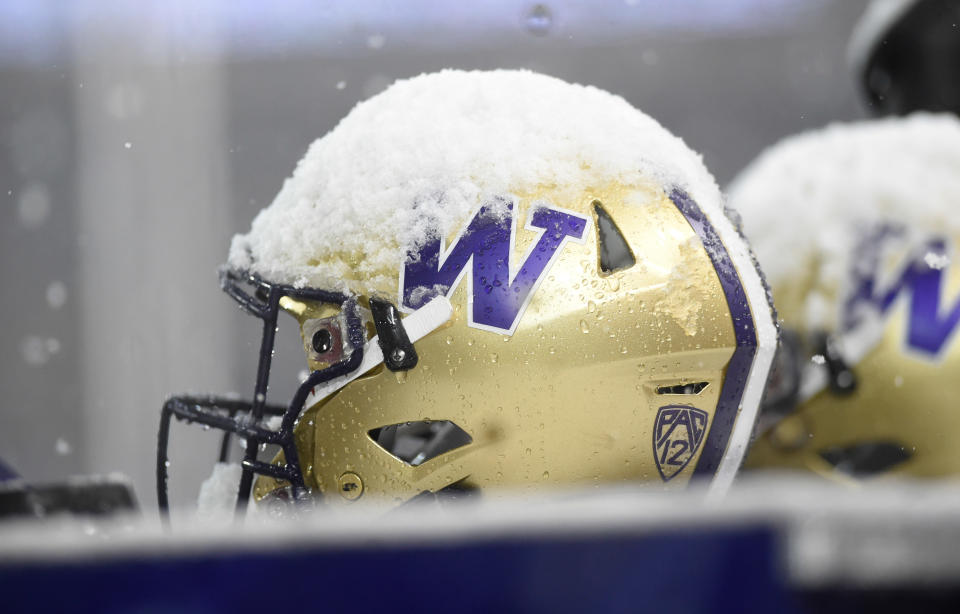
Why the Ranking
If the Purdue and Northwestern helmet had a baby, this is what you’d have. I mean, the Washington helmet is really the Purdue helmet, but with a “W” and purple color scheme. We can’t really rank those two far apart because of it, but purple is more appealing to the eye than the Boilers’ gold and black, so all things being relatively equal, the Husky lid gets the nod over the choo-choo school.
Minnesota Golden Gophers
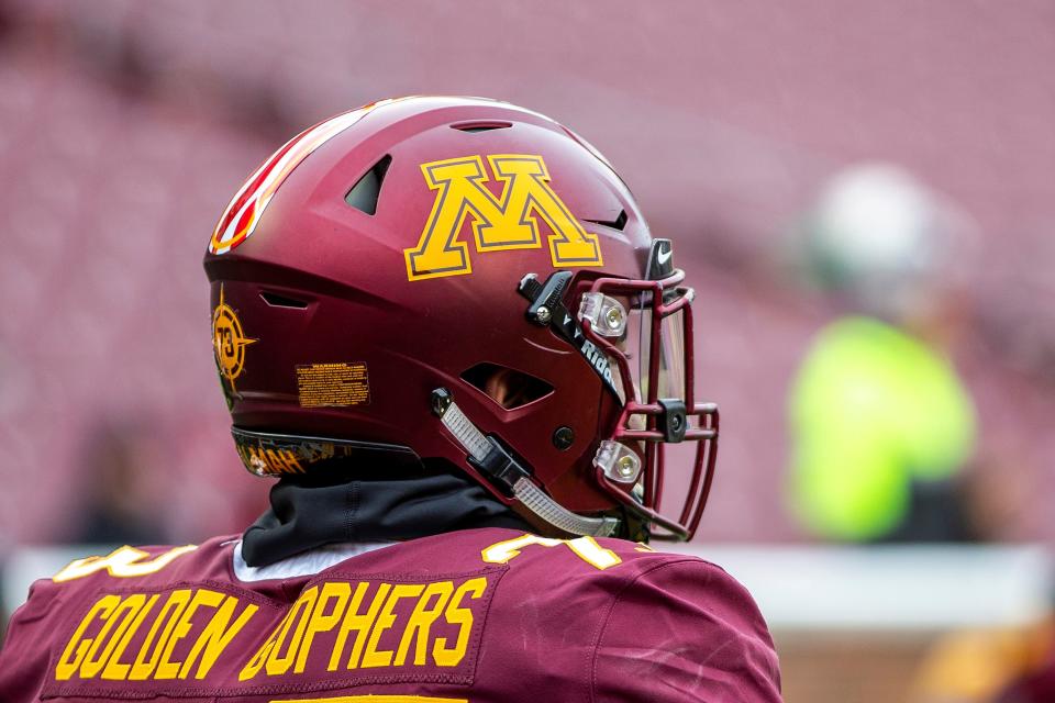
Why the Ranking
The gold helmet Minnesota breaks out from time to time actually looks pretty sharp and futuristic, but that’s more of an alternate lid. This is the one we’re accustomed to seeing, and it’s awfully hard to pull off some of the ugliest colors in college football. It works though, and it’s a good job of doing something with little to work with. Sounds a lot like the Gophers’ recruiting classes over the years. Good job rowing that boat to shore on this one.
Northwestern Wildcats
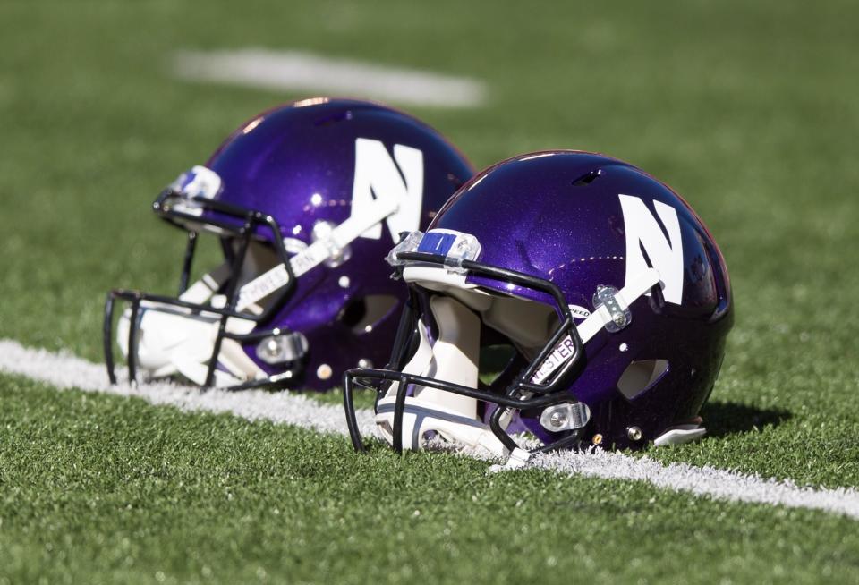
Why the Ranking
To be honest, Northwestern doesn’t use this helmet as much as it used to, but the solid purple top is what the Wildcats are known for. We’re really still in boring territory here, but you have to give credit for men full of testosterone being able to rock out purple on the football field. Also, creative points go to whomever decided to carve out as little space as possible in a white block to make it look like an “N.”
Wisconsin Badgers
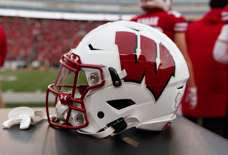
Why the Ranking
Wisconsin used to have a plain “W” on the side of the helmet much like what we see with Nebraska. The program went through a facelift though when Barry Alvarez put the headset on and did an outstanding job with the curved lettering and shadow outline. Great job with the proportions, too. It’s not a great helmet, but it has become a good one that lets you know you are watching college football in the Midwest. But … where’s the cheese?
Michigan State Spartans

Why the Ranking
I actually like what Michigan State has done to its helmet design. Now, if the Spartan program will quit changing it, maybe it’ll be on to something. This is clean, but an updated Spartan on the side. At least the Spartans didn’t just go with the obligatory “M” or “S” on the side. It’s a helmet on a helmet! Nicely done.
UCLA Bruins
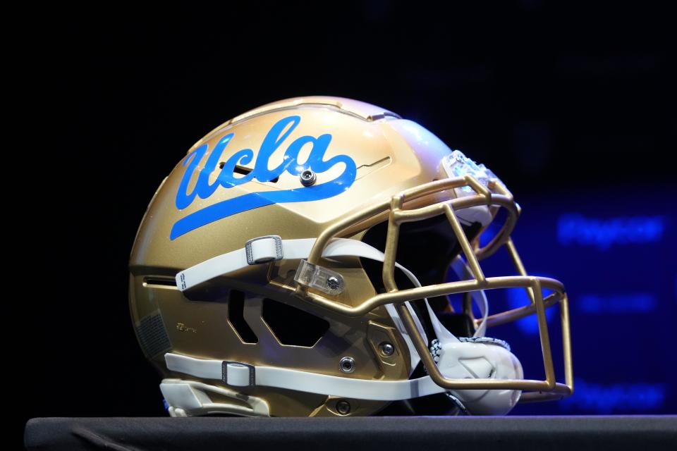
Why the Ranking
UCLA most recently went with the baby blue on the side and discarded the darker blue. It looks much better, especially with the cursive that’s been used for a long time. This is exactly the type of thing that can be done to update a traditional look to make it pop just a little more without ticking off the fanbase. There’s not a whole lot to it, but it works and looks great.
Iowa Hawkeyes

Why the Ranking
Aside from an upgraded logo design for the Hawkeye head, this helmet has looked relatively the same since I was a kid. You might think a bird on the side of a helmet looks corny (even for Iowa), but we beg to differ. The black and gold together with the logo looks great still to this day. Now, we won’t get into the Steelers rip off uniform design until another time.
Oregon Ducks
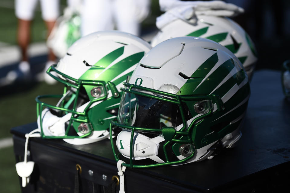
Why the Ranking
Anytime you are ranking anything Oregon related with a football uniform, you have to figure out which ensemble you are ranking. The fact that the Ducks switch helmets and uniforms so often makes it difficult to put them at the top, but honestly, I’ve never seen a helmet I don’t like here. It’s not easy to do much with a mascot of a Duck, but Oregon has been cutting edge and helped usher in new designs and combos, so you have to respect it. Anything with wings on the side takes flight in these rankings … at least in my opinion.
Ohio State Buckeyes
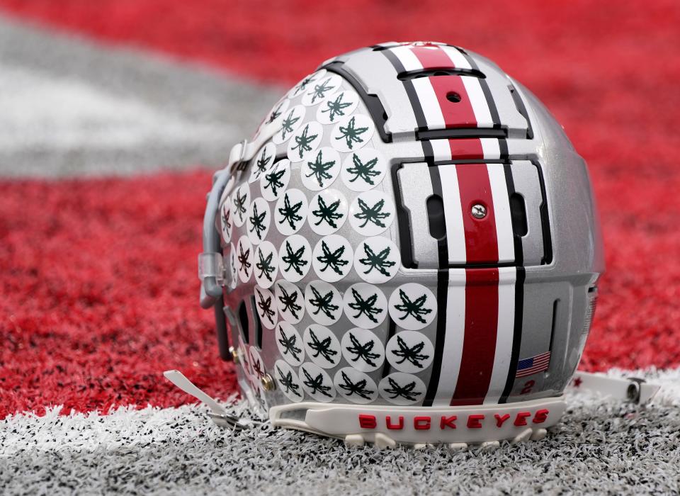
Why the Ranking
It seems like people either love or hate the Ohio State helmet. And, I have to admit, the early season look is not as iconic as the late season one that has Buckeye leaves plastered all over that silver sparkle. But we’re going with the iconic look of the stickers on the helmet. The colors, those stickers, and design look great in prime time, and that’s what it’s all about.
Michigan Wolverines
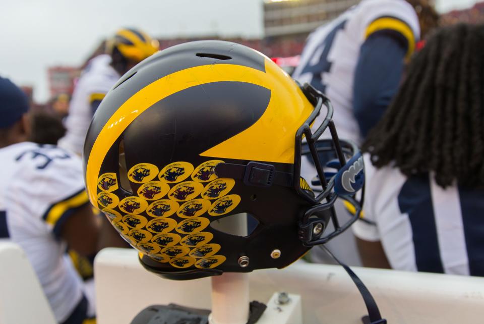
Why the Ranking
I know, I know, we should hand in our Ohio State fandom card by picking something Michigan over OSU, but you have to give credit where credit is due. There is not a better helmet in college football. The Wolverines weren’t the first program to use winged helmets, but they made the design their own and it’s an icon and symbol of the sport. The fact that it looks good on a Maize and Blue palette sets it off even more. We won’t quite go down the path of Michigan copying the sticker idea from Ohio State, like a lot of things with its program.
[lawrence-auto-related count=3 tag=669142128]
[affiliatewidget_smgtolocal]
Contact/Follow us @BuckeyesWire on X (formerly Twitter), and like our page on Facebook to follow ongoing coverage of Ohio State news, notes, and opinion. Follow Phil Harrison on X.

