Fans rejoice as the New York Jets revive their favourite logo design
The New York Jets has finally given in to fans and brought back the logo design they wanted. One that actually features a jet.
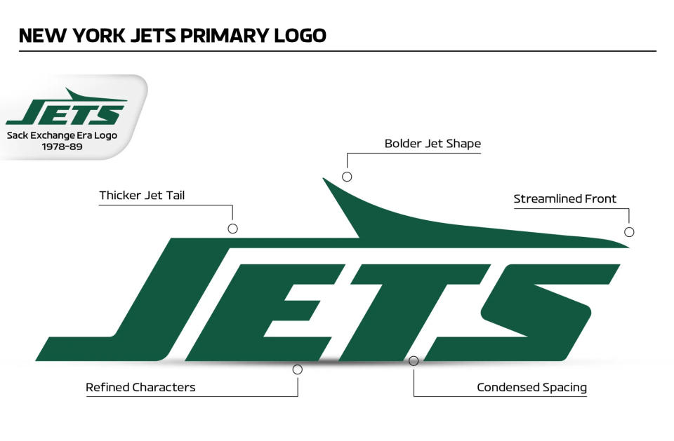
The NFL team's logo from the 1970s may make it look a little like an airline, but it brings back fond memories for fans due its associations with the 1980s Sack Exchange era. And it's been given a more contemporary update, with refined letters and the team's current colours. It might now be up there with the best NFL logos.
A post shared by New York Jets (@nyjets)
A photo posted by on
The last New York Jets logo introduced in 2019 brought 'New York' to the front and introduced a new Gotham green colour, but it stuck with an American football inside an American football, and no jet in sight. Jets fans have long called for the return of a logo featuring an actual jet, and the team has finally listened.
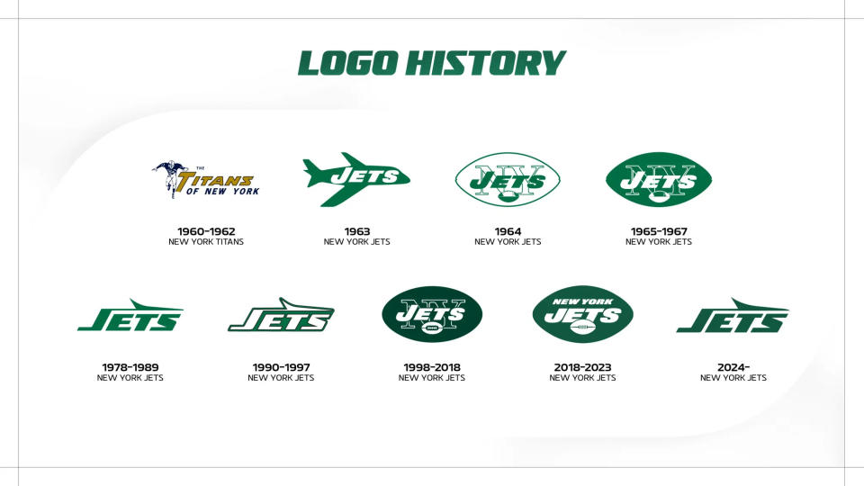
The new logo is a reworking of a previous design, which was the work of Jim Pons, the team's then video director and the former bass guitarist for Frank Zappa's band, The Mothers of Invention. The team's name features the abstract shape of a jet plane extending from the 'J' across the top of the other letters, tying in with the history of the team's name, which was changed from Titans of New York in 1963 to reflect the Jets' stadium's location near LaGuardia Airport.
The last version of the design was retired in 1997, so the new logo feels nostalgic. But it also has a few tweaks, including a bolder jet shape, thicker jet tail and changes to the spacing between the letters. It also keeps the Gotham green colour of the last logo design, which the team says is a better fit with today's metallic helmets than the Kelly green used in the 1980s. There's also a new portfolio of secondary logos.
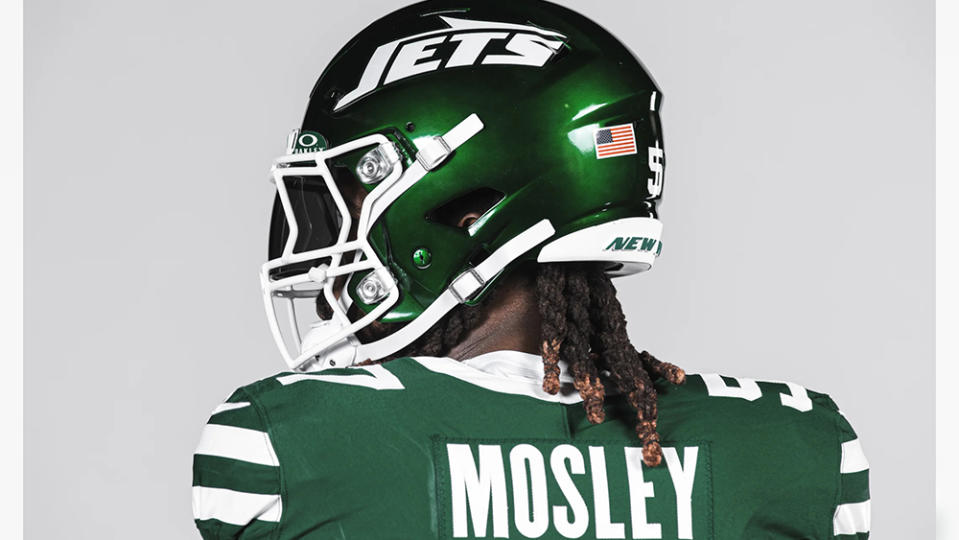
The redesigned logo is part of a wider rebrand that includes the launch of the Legacy Collection of uniforms, which players will wear over the next five seasons. There are three uniforms – green, white and black – all with double-striped sleeves and single-striped legs to match the uniforms from the Sack Exchange era.
“We listen to our fans,” team president Hymie Elhai told The New York Post. “One of the things we talked about internally is that iconic teams have iconic uniforms, and that logo and that era connects with people’s Jets fandom. The Yankees don’t really change … same with the Rangers, same with the Knicks. They all sort of resonate that way. That’s what people grow up following — making their connection to their team.”
Fans seem to be happy with the news. "I’m so glad that logo is back. That is the best logo we have ever had" one person wrote on YouTube. "We better end the season with as many wins as we have logos," another fan quipped on Instagram. It might now be up there with the best NFL logos.
For more inspiration see our pick of the best sports logos.
