
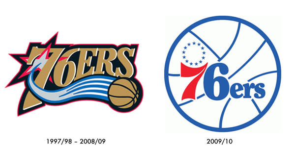
Philadelphia 76ers return to old logo, uniforms
Forget Richard Jefferson(notes) going to San Antonio, Minnesota trading Miller and Foye to Washington for the fifth pick and change, or Milwaukee acquiring forward Amir Johnson(notes). The best "move" of the young offseason clearly belongs to the Philadelphia 76ers' marketing department.
Tuesday, the Sixers officially changed their primary logo and color scheme with a return to the traditional "76ers basketball" logo and the red, white and blue color scheme. The vintage logo was last used during the 1996-97 season and consists of a color scheme that was originally established in 1963 and used during the Sixers' two championship seasons.
Brand New, an excellent site that focuses on corporate and brand identity work, points out that the new logo is nearly identical to the old one, except for a bolder 6, "which was surely changed to perform better on all sorts of production techniques."
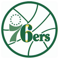
The small picture to the right, again via Brand New, illustrates just how similar the two logos are — the new logo (in yellow) overlays the old one (in blue), so anything that is green remains the same.
This is the first major logo change for the Sixers since the 1997-98 season, when the logo was modernized to incorporate black, silver and gold into a stylized "76ers" wordmark. Now if they could just put down that creepy Donnie Darko-like mascot ...
While the new official uniforms won't be unveiled for a few more months, The 700 Level's inside sources tell them the threads will be an updated interpretation of the throwback unis they wore this year.
Chuck and Moses couldn't be happier with the decision ...

