What color is replacing gray? This is the one color to use instead of gray in 2023, say designers
Now that gray has fallen out of favor, you may be wondering what color is replacing gray. Of all the neutrals, gray is the one that always held the most gravitas with designers and decorators, however, gray is slowly being replaced by beige.
Elegant and timeless in their simplicity, beige schemes have become a stalwart in the world of interiors. As anyone who has been through the process of searching for color trends and room color ideas will attest, choosing the right color for a room can be a minefield with endless choices and subtle nuances to understand and overcome.
'Choosing color, especially when it comes to neutrals, is one of the hardest parts of decorating because we only actually know the true color of something because it’s sitting next to another color,' says Rachel Chudley, an interior designer renowned for her use of strong color.
Here, designers, decorators, and color experts reveal why beige is replacing gray for 2023, and how to decorate with beige for a beautiful scheme every time.
What is the new gray in interior design
Beige room ideas are the new gray in interior design, and it isn't too difficult to see why. The beauty of a neutral scheme is that it provides a wonderful scaffold upon which to hang accents of color, adds Deborah Bass, founder of Base Interior.
‘This is especially true in a home office where a neutral wall or a textured plaster or wallpaper wall finish creates a background for books and art, both of which can take the decorative center stage.’
She recommends grounding subtler shades with deeper, richer natural timber to create a balance. ‘Neutrals offer an elegant, timeless response to the working from home dilemma, likewise versatile in the sense that different family members might be using the space at different times of day and for a variety of functions,’ she adds.
Is gray out of style for 2023?
Like most things, color and home decor trends come and go, so while the cool-toned grays of the early noughties were hugely popular, we are now seeing a sudden and sharp shift away from cool tones in favor of warmer color schemes. Colors like beige, amber, ivory, rust, and sepia tones are taking over.
In the West, grey is associated with dullness, boredom, and old age, so it comes as no surprise that this 'trend' was never going to go the distance. Being surrounded by too much grey can leave you feeling drained and depleted of energy, and I am not the only one who is tired of the endless velvet grey sofas, carpets, walls, and decor that have graced homes over the past decade.
'The decline in all over grey color schemes reflects our ongoing desire to make our homes, in which we’ve all come to spend more time, feel special and layered,' says Anthony Barzilay Freund, 1stDibs’ editorial director. 'Comforting colors, particularly those that evoke nature and warmth, are visually interesting and also feel emotionally reassuring.'
But if you still love gray, all is not lost. There are still certain shades of gray that look fresh and contemporary. Grey tones can make a lovely palette for the home as they exude a sense of calm, believes Charu Gandhi, founder and director of Elicyon.
‘Grey might be considered boring or cold, but there are ways to make it feel warm and a focal point. While in previous years cool greys alongside silver and high gloss tones were fashionable, we are using deeper, darker greys or even near-blacks in some of our homes. These richer tones envelop you as you enter the room and add coziness. To avoid the room feeling somber, it’s important to pair grey with pops of color and texture in accessories such as pillows or throws or artwork.’
What can I paint walls with instead of gray?
Using an off-white or natural palette is all about adding depth and contrast in different layers and textures, says Jane Landino, creative head of the studio at Taylor Howes.
‘To make a neutral palette feel designed and considered it’s important to mix and match patterns, albeit neutral ones, and occasional pops of color. Just because something is beige doesn’t mean it has to be plain: think about the application, too.
Beige is one of the most versatile shades in all of design – it instantly brightens while evoking a sense of calm and flawlessness. Add interest through colorful art, accent soft furnishings, and antique furniture and objects. It also makes it easier to change up the look of a room.
For a warmer, cozier aesthetic, consider a red-based neutral shade such as Wimborne White or Dimity by Farrow & Ball, recommends Louise Wicksteed, design director at Sims Hilditch.
How do you decorate with beige
A neutral color palette doesn't have to mean dull – let your room sing out with a tonal color palette. Here's how the experts get it right...
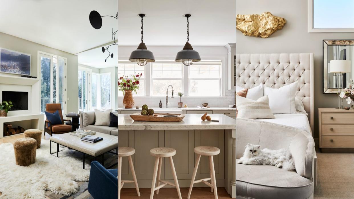
1. How to use beige in a kitchen

The beauty of a beige or cream kitchen is that it brings a certain timelessness and longevity to the design.
Go back to basics with beige and it will allow the rest of the fixtures and furniture to truly sing. Alongside all the clamor of color, pattern, and shape in current interior design, there’s a quieter story of considered, understated forms and textures at their finest.
If you're wondering how to make a small kitchen look bigger, beige is a smart color choice. Unlike white, it will feel more welcoming and home buyers love cream kitchens, too, which is always a bonus.
2. How to use beige in a living room

Beige living rooms offer infinite possibilities for making this family space feel airy and relaxing, refined and timeless. However, beige living room paint ideas alone are not a fail-safe option – and it is all too easy to fall into the trap of using bland, dull colors that are nothing like the subtle, complex schemes featured here.
'Natural textures, whether they are stone or wood or linen, can help to anchor a neutral color scheme,' says interior designer Tamsin Johnson. 'It means that the overall look doesn’t feel too contrived or uptight or overly designed. They bring a laid-back quality that always works well.'
3. How to use beige in a bedroom

Subtle nuances of color are why James Thurstan Waterworth, founder of Thurstan, favors neutral colors in his schemes because they create a soft springboard from which antiques, art and other embellishments are able to sing.
‘You can then build out from here with tactile surfaces, patterned textiles, eclectic furnishings and more modern flourishes to create layers of interest, while still allowing all the individual elements of the interior to breathe.'
Designed by Jessica Bennett of Alice Lane Interiors, this beige bedroom is anything but boring thanks to the use of texture and subtle hints of color.
‘I often find, especially with a neutral background, that adding in pops of color can add so much personality of your own to a space by choosing colors you love and tying those in with the cardinal directions of each room to make sure they complement the natural light (or lack thereof) in each room,' she adds.’
4. How to use beige in a bathroom
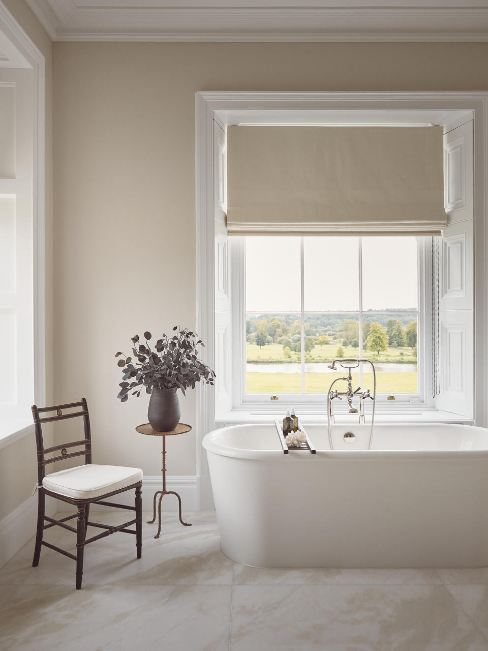
When decorating a neutral bathroom, yet wanting to maintain a soothing environment, remember that accent colors can be introduced using elegant fragrances or bath oil bottles, says Sarah Ward, co-founder of Ward & Co Interiors.
‘Colored glass accessories add vibrance, particularly when lit together with soap, towels and art.’ Floral fixtures, and reclaimed furniture too, can be used creatively to weave in another color or tonal contrast.’
5. How to use beige in an entryway
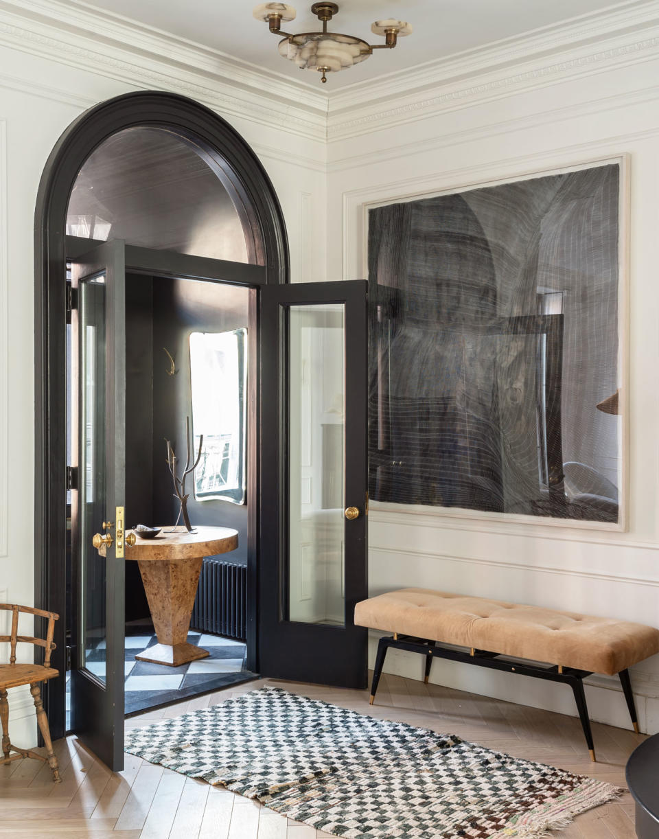
I adore the calmness that you create when you have a neutral palette in a room. But this choice definitely doesn’t have to mean boring: you can create an interesting and exciting space by layering different tones, such as off-whites and beige, then introducing a range of caramels and even accents of black.
Here, designer Athena Calderone, founder of eyeswoon, has masterfully mixed warm neutral with accents of black and hints of gray. 'If I’ve got a calm beige color scheme, then I focus on texture to bring different layers of interest,' she says.
You have to think about how to introduce variations and things that feel different to the touch without just focusing on the beige color scheme, and often that creates a more interesting scheme. Varying glossy, shiny surfaces with matt ones adds an extra layer of texture and tactility.
6. How to use beige in a laundry room

A warmer alternative to the once-popular gray, beige is easy to live with and can make a beautiful foundation for both contemporary and traditional schemes.
'More than ever, we’ve seen that there is a greater need to surround ourselves with comforting, soothing colors that are not only easy to live with but provide warmth and serenity within our homes. This has been reflected in the increasing popularity of warmer neutrals, in a clear shift away from the cooler, blue-toned grays. Instead, consumers have been opting for earthier tones that have an inherent warmth,' explains Ruth Mottershead, creative director of Little Greene.
'Beige and brown both work well in the laundry room, they are inviting colors that remind us of the outdoors and nature and so encourage us to relax, which is particularly important in what could be perceived as a stressful space' says Justyna Korczynska, senior designer at Crown Paints.
7. How to use beige in a dining room

'There is something intrinsically beautiful about curating a calm formal dining room,' says designer Tiffany Leigh. Beige is wonderful for this, but that doesn't mean you need to do away with gray entirely. This entire scheme is built upon a tonal palette of beige, dark brown, and mid-gray.'
Having said that, you shouldn’t be afraid of adding a single bold statement piece, even in a room that’s neutral. I think a strong black metal or ebonized wood statement design can work brilliantly as the centerpiece in an otherwise pared-back room. It makes all the other elements come together around it.
Ryoken Guesthouse Paint
This tranquil, mid-tone classic tan beige is said to be 'the next best thing to being in Japan'.

Interior Motives Paint
The color and tone of the moment, this warm, gray-beige that can skew taupe depending the light.

Brooklyn Cowboy Paint
A warm, earthy beige inspired by a real Brooklyn Cowboy. This is a wonderful choice for the bedroom.

