
All 30 MLB Players Weekend uniforms, ranked
Apparently, we really like yellow. That’s the takeaway from The Stew’s rankings of the special Players Weekend uniforms that Major League Baseball players will wear this Friday through Sunday.
Players Weekend is a chance for baseball to show its fun side and for players to show their flair. Players can wear nicknames on their backs of their jerseys and they can go wild with customized accessories. It’s a swift departure from buttoned-up baseball tradition, but that’s OK for one weekend per year.
[Shop the Yahoo Sports store for your Players Weekend jerseys and caps]
With Players Weekend comes 30 new uniforms. Some are very bright, very colorful and very different. Some aren’t as boundary-pushing. Nonetheless, baseball uniforms always bring out opinions.
So Big League Stew’s Chris Cwik, Mike Oz, Liz Roscher and Mark Townsend each ranked the jerseys 1-30, we added up the results and now we present our official rankings, from best to worst of MLB’s 2017 Players Weekend jerseys:
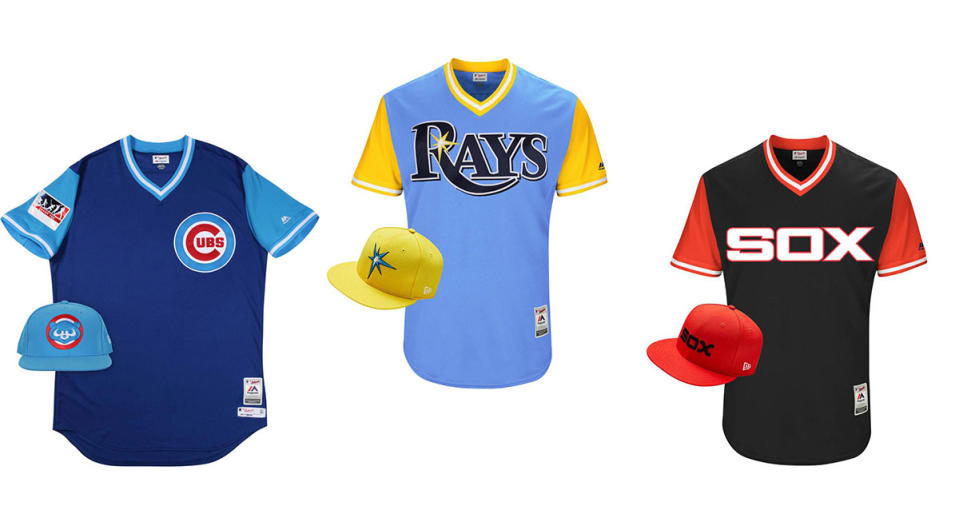
1. Pittsburgh Pirates
The old-school Pirates look is fantastic. It brings both a throwback vibe, but it’s colorful enough to stand out for something like Players Weekend.

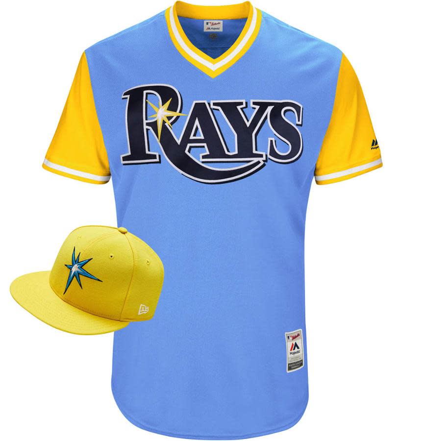
2. Tampa Bay Rays
Serious here: If the Rays started wearing uniforms like this all the time, we wouldn’t hate it.
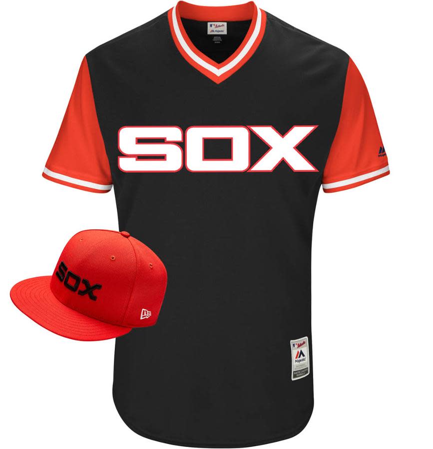
3. Chicago White Sox
The White Sox have an abundance of good-looking unis in their past. These combine the block Sox logo of the ’80s with their black-and-red color scheme from every further back in the day. It’s a strong pair. You can never go wrong with red and black in Chicago, right?
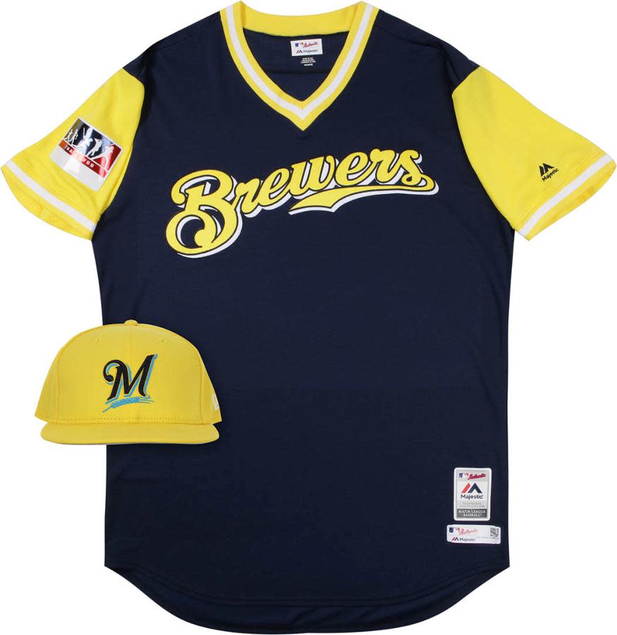
4. Milwaukee Brewers
OK, now theeeeese are colorful. But they work. Maybe not every night of the season, but as a one-off, these are a pretty fun uniform for the Brew Crew.
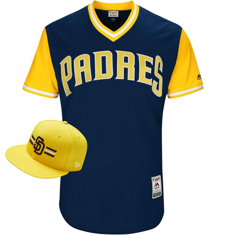
5. San Diego Padres
You’d think the Padres would go brown and you’d think if they didn’t go brown, it would be a disappointment. But these are actually pretty nice. The SD cap with the lines is a nice touch.
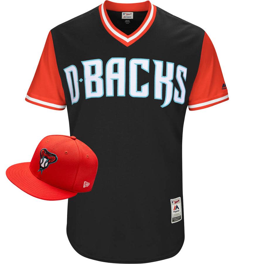
6. Arizona Diamondbacks
The Diamondbacks wear more uniforms than any team in baseball. They don’t need another. But this is pretty sweet. They should consider keeping it around.
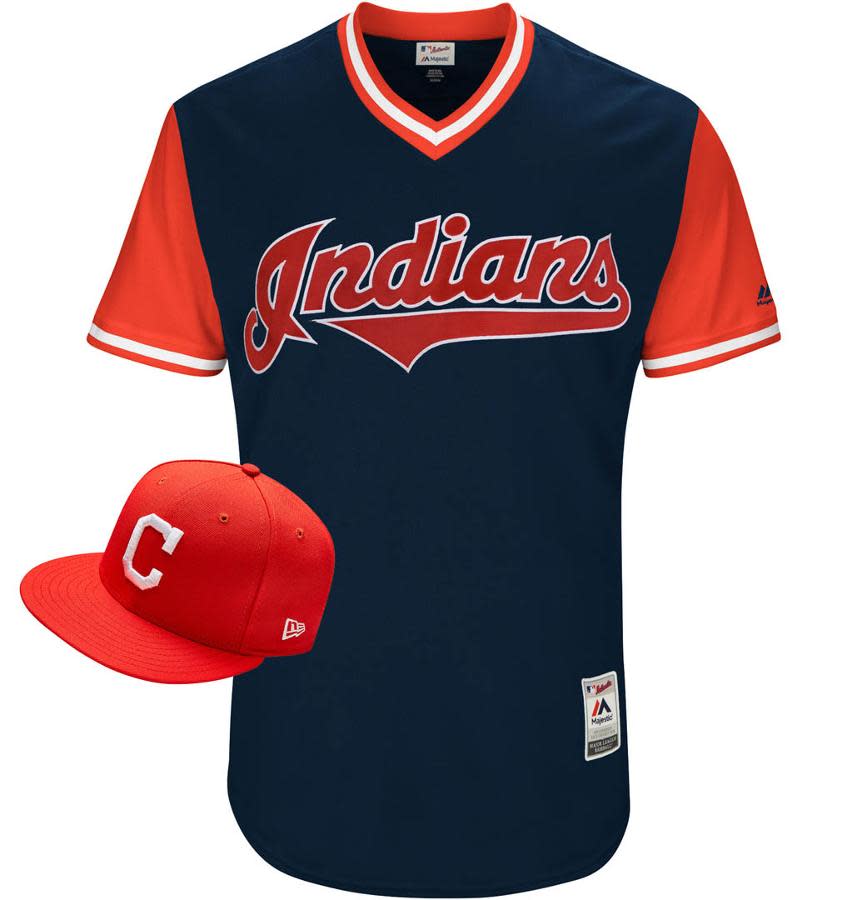
7. Cleveland Indians
Simple, classic, clean and effective. Good job on this Indians look.
8. Oakland Athletics
The A’s have used different combos of green and yellow over the years, but this is a new one. And it’s not bad.

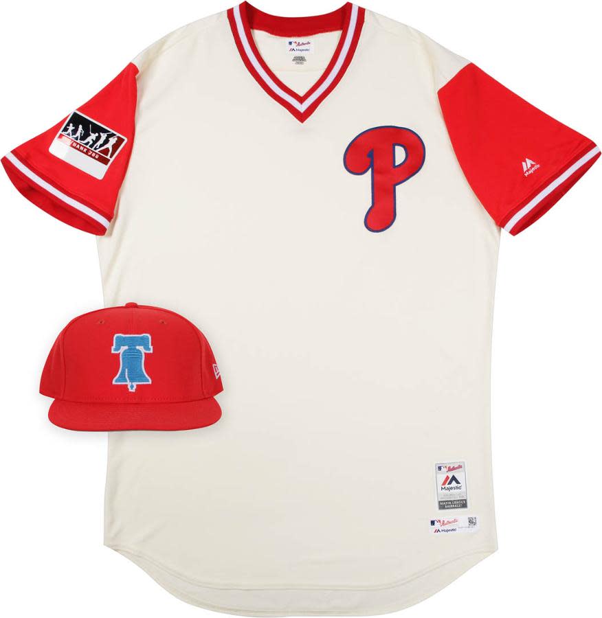
9. Kansas City Royals & Philadelphia Phillies (tie)
Out of everything you see below, the Phillies bell cap is the best thing.

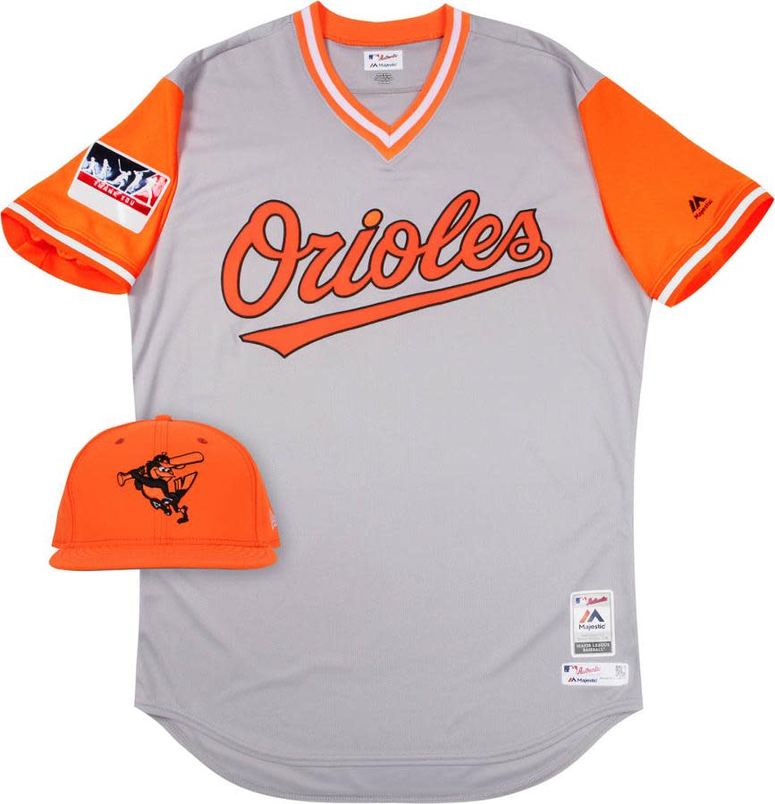
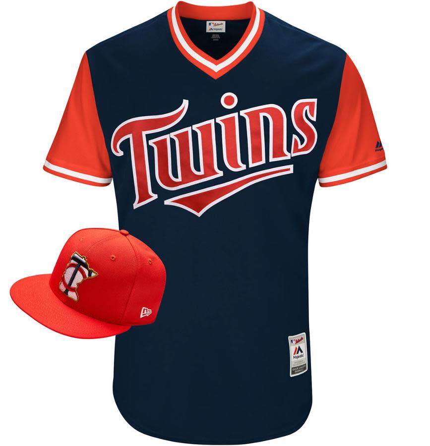
11. Baltimore Orioles & Minnesota Twins (tie)
The Orioles have the best of the gray jerseys for Players Weekend. The Twins’ look isn’t too much of a departure from their usual unis, but the caps is interesting.
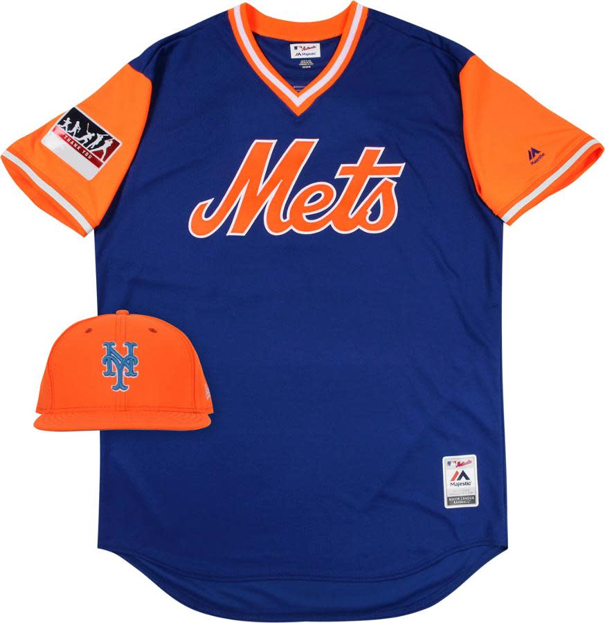
13. New York Mets
No matter how you dress them up, the Mets logos are always going to look nice.
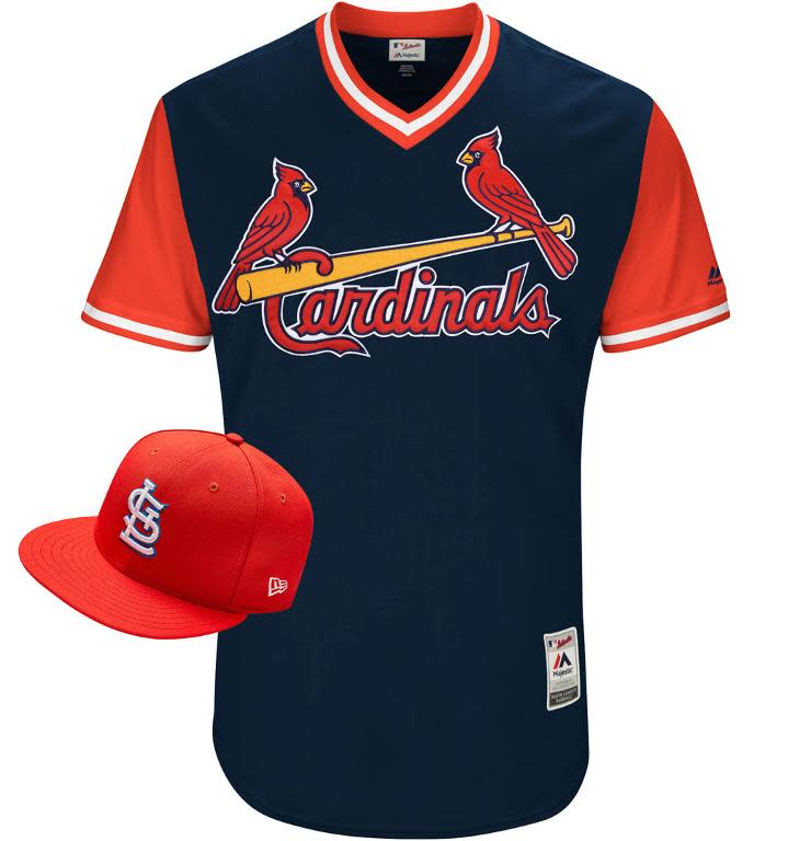
14. St. Louis Cardinals & Colorado Rockies (tie)
Quite a contrast here: The Cardinals’ look is traditional but strong. The Rockies’ look is quite different.

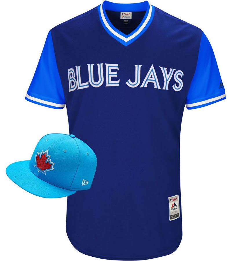
16. Toronto Blue Jays
Lots of different blues here for the Blue Jays. I guess that’s allowable when blue is actually in your name.
17. Los Angeles Angels
These are pretty close to the usual Angels caps, but the jersey is a strong offering for them.

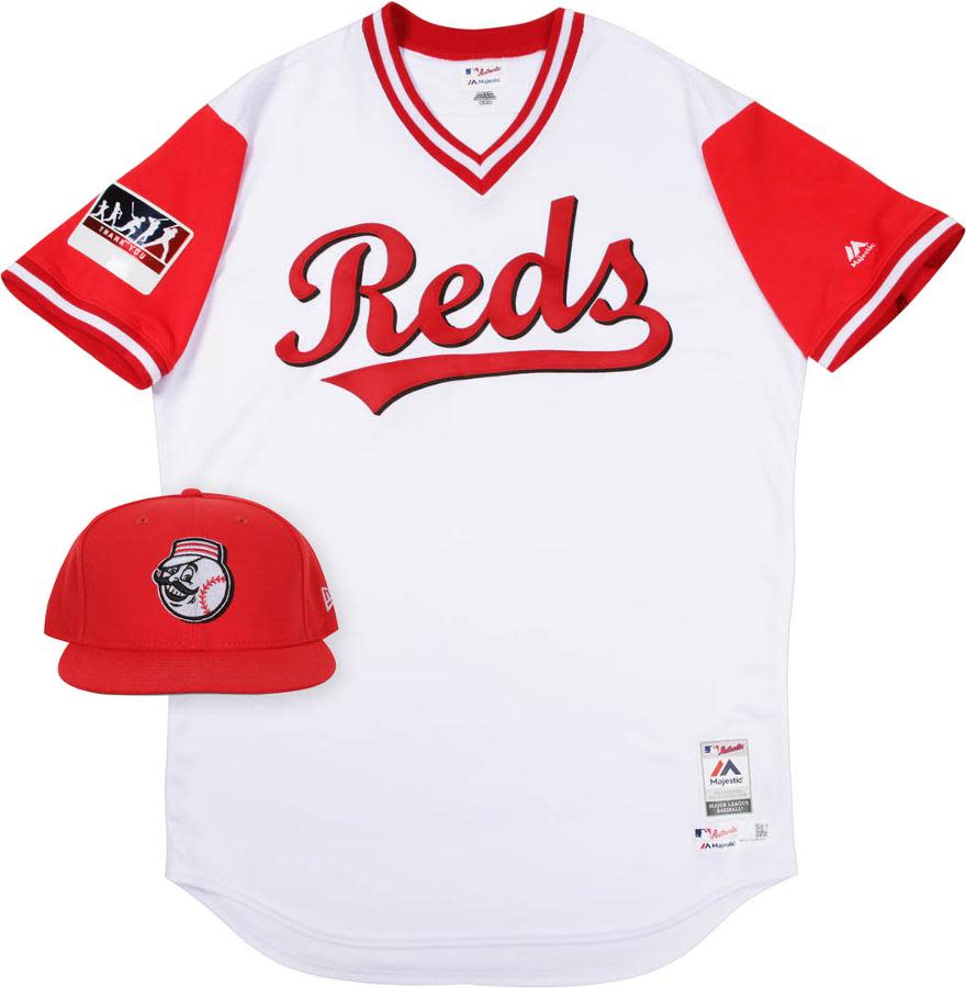
18. Texas Rangers & Cincinnati Reds (tie)
Both good options that these teams should consider keeping around for spring training.

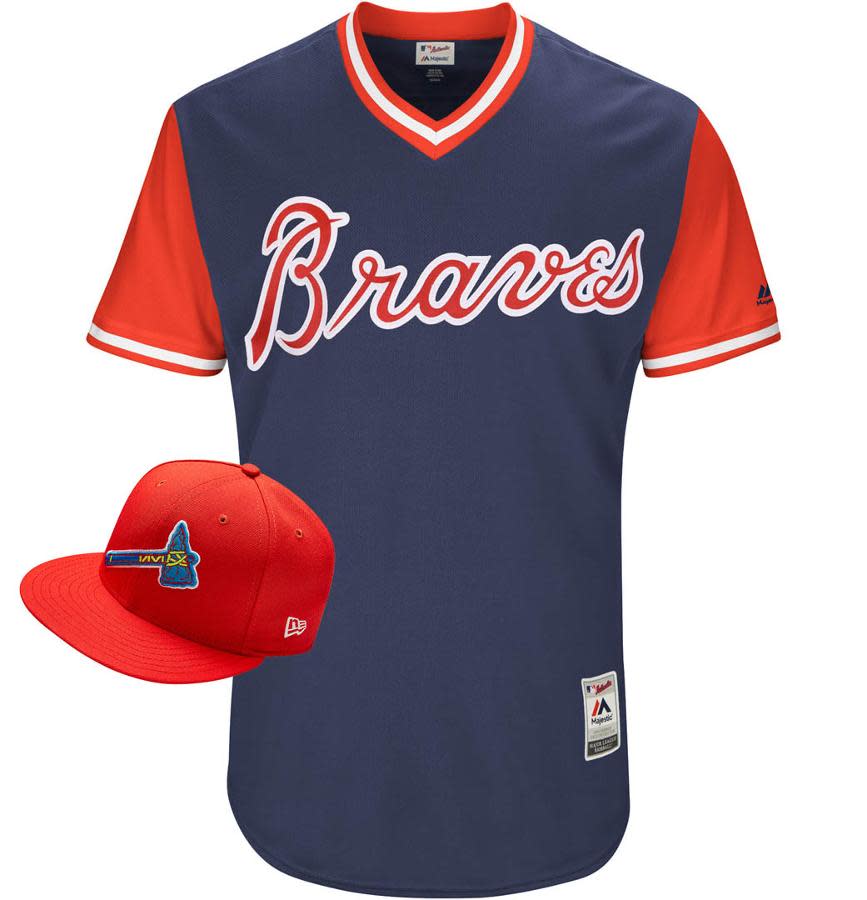
20. Atlanta Braves
The Braves jersey is good, but Players Weekend seems to call for their old-school cursive A cap, don’t you think?
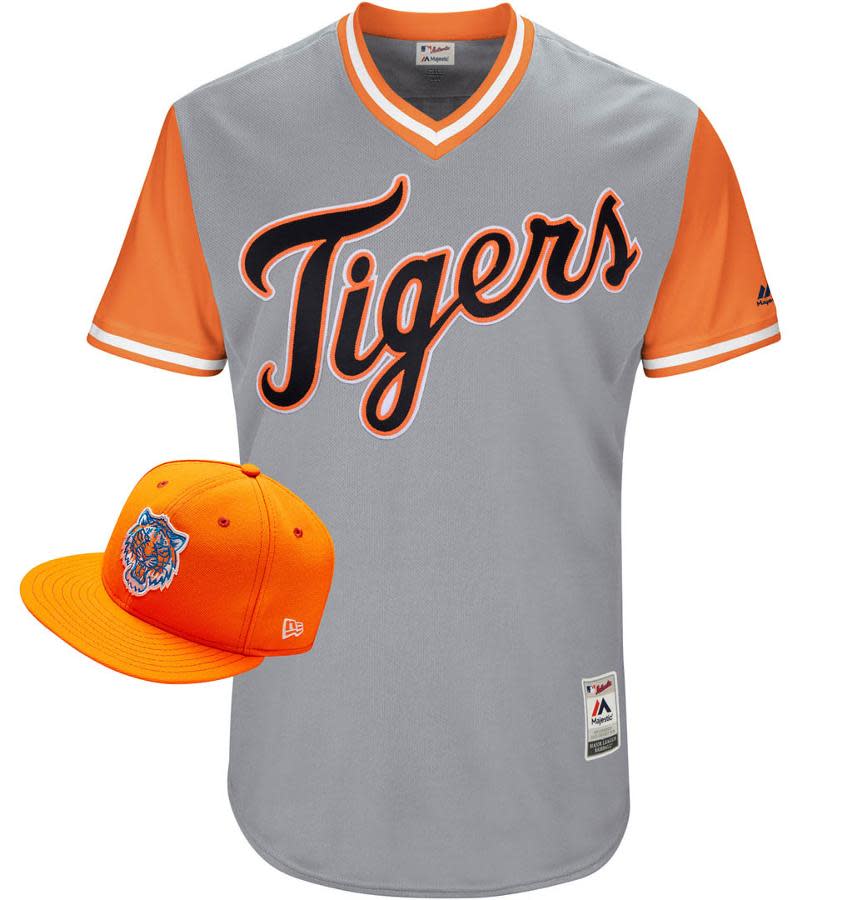
21. Detroit Tigers
That is a briiiiiiight orange cap.
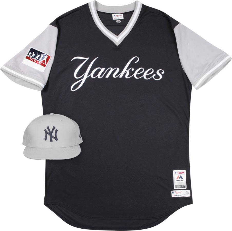
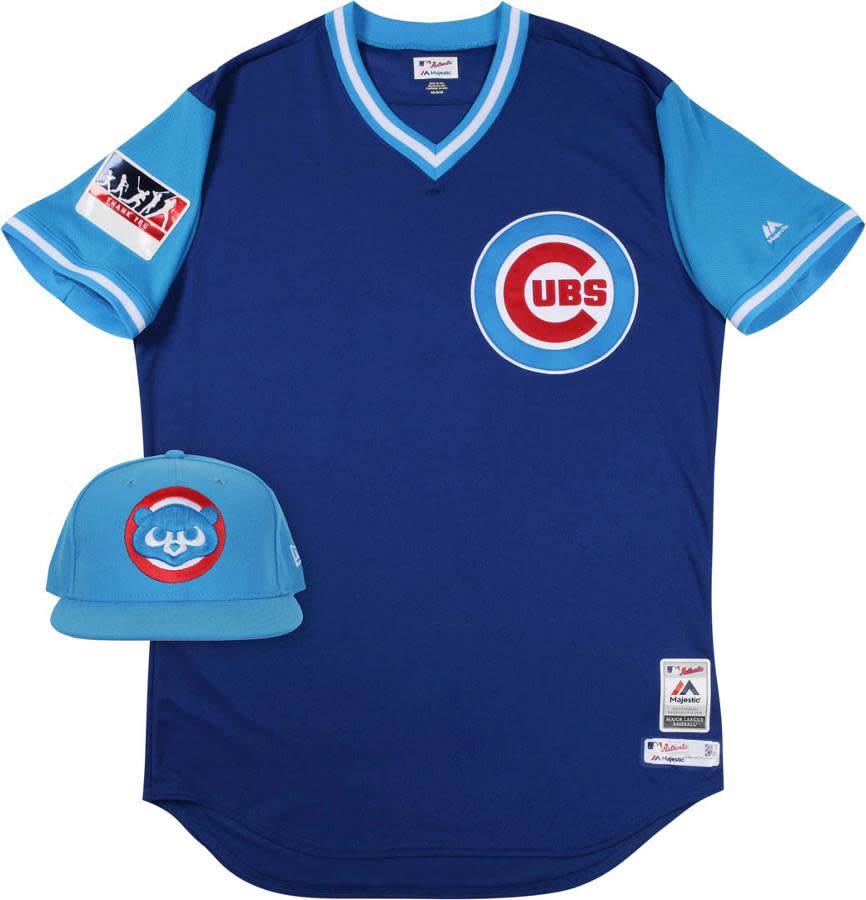
22. New York Yankees & Chicago Cubs (tie)
Not to incite the entire Bronx, but does the Yankees uniform kinda look like something you’d buy at the swap meet? The Cubs cap is great, but the jersey doesn’t rank as high.
[Now’s the time to sign up for Fantasy Football! Join for free]
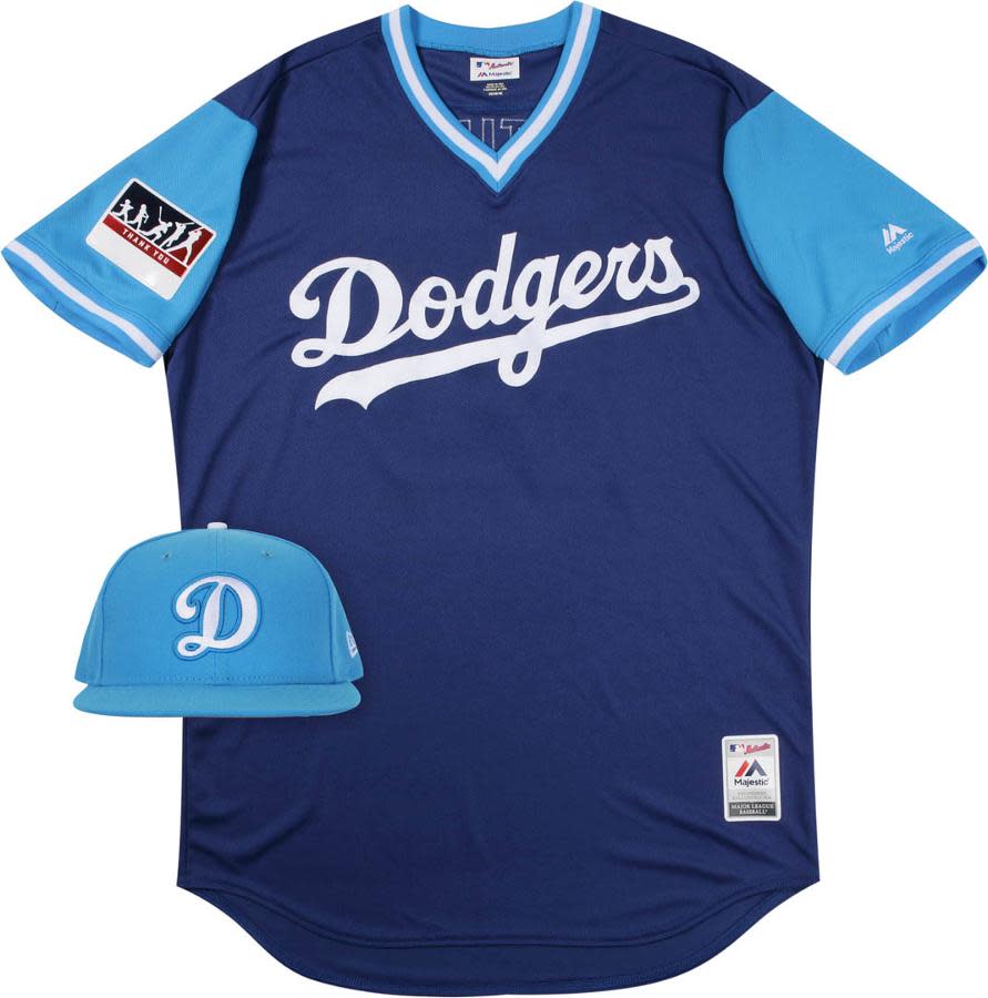
24. Boston Red Sox & Los Angeles Dodgers (tie)
It’s just weird seeing the different blues here — the lighter blue on the Red Sox cap looks out of place and the lighter blue on the Dodgers always seems strange.

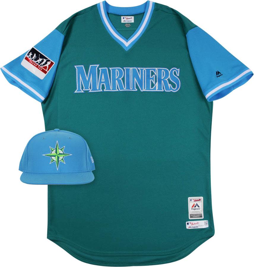
26. Seattle Mariners
The Mariners have had some nice looking uniforms in the past. This might not go down in history as one of the best.
27. Washington Nationals
The cap and jersey almost seem like two different ideas, both good but they’re not a coherent pair.

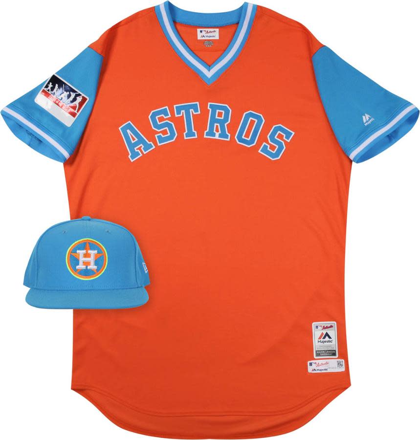
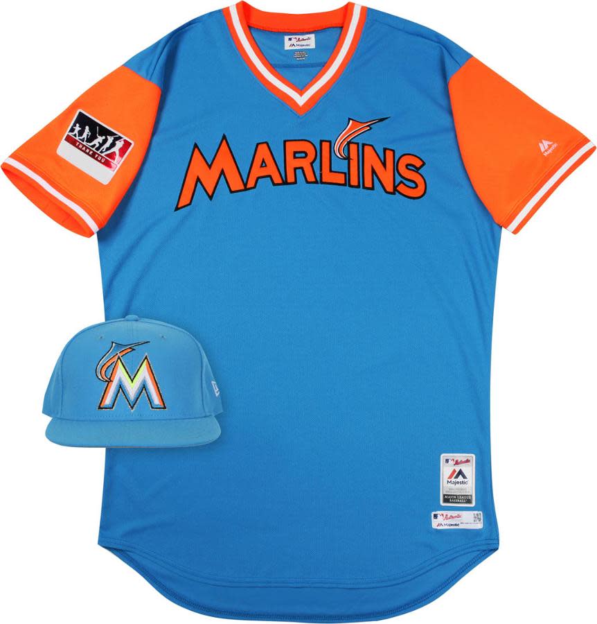
28. Houston Astros & Miami Marlins (tie)
Imagine that, a tie. Especially since the Astros and Marlins jerseys are so similar looking.
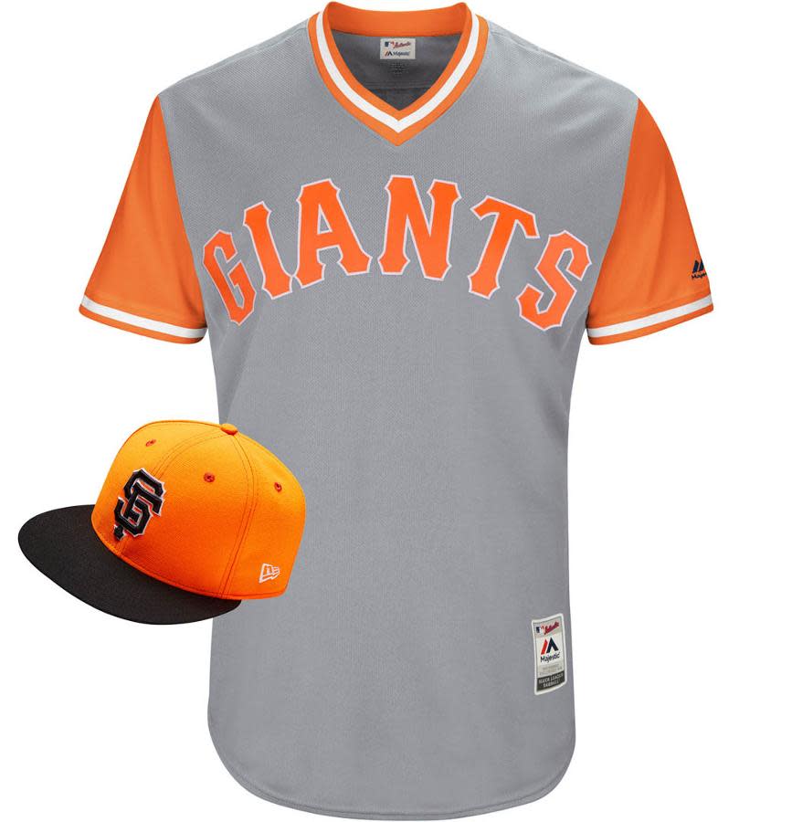
30. San Francisco Giants
It’s not the Giants’ year, apparently. At least their regular jerseys are always great-looking.
Are you curious to see how each of our writers voted? In the interest of transparency, here’s how they ranked each uniform.

More MLB coverage from Yahoo Sports:
– – – – – –
Mike Oz is the editor of Big League Stew on Yahoo Sports. Have a tip? Email him at mikeozstew@yahoo.com or follow him on Twitter! Follow @MikeOz

