Warren Buffett's Market Indicator Reaches 130%
- By James Li
On Feb. 17, 2017, the U.S. total market cap / gross domestic product ratio reached 130%, a critical milestone as valuations remain significantly overvalued. Most of Warren Buffett (Trades, Portfolio)'s portfolio holdings as of Dec. 31, 2016, have price-sales valuations greater than the 80th percentile of the industry. Such companies include The Coca-Cola Co. (KO), International Business Machines Corp. (IBM), Delta Air Lines Inc. (DAL), Apple Inc. (AAPL) and Southwest Airlines Co. (LUV).
Warning! GuruFocus has detected 7 Warning Signs with KO. Click here to check it out.
The intrinsic value of KO
Buffett indicator reaches critical milestone
Buffett pointed out that the ratio of the Wilshire 5000 full-cap index over the gross domestic product is "probably the best single measure of where valuations stand at any given moment." The total market index is currently $24513.4 billion, about 130% of the last reported U.S. GDP. Such market valuations seldom appeared since the dot-com bubble of 2000, when the Buffett indicator reached nearly 150%. Figure 1 shows the historical trendline of the Buffett indicator since 1970.

Figure 1: The Ratio of Wilshire 5000 to GDP as of Feb. 17
As illustrated in Figure 2, the "predicted and actual stock market returns" graphs the expected annual returns for three different scenarios: the optimistic case (red trendline), the pessimistic case (green trendline) and the median case (blue trendline). For the optimistic case, which is based on a TMC/GDP ratio of about 120%, the expected annualized market return is approximately 4.2%. Likewise, the pessimistic case, which is based on a TMC/GDP ratio of about 40%, gives an expected annualized market return of -8.5%. Based on a median TMC/GDP ratio of about 80%, the expected annualized market return is currently -0.7%.
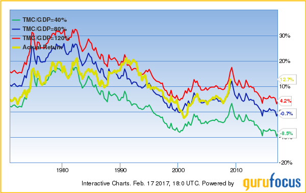
Figure 2: The Predicted and Actual Stock Market Returns as of Feb. 17
Stocks reach high price-sales ratios relative to industry medians
While the Buffett indicator determines the valuation of the entire U.S. stock market, we can analyze the price-sales ratio of the individual companies to identify which companies are significantly overvalued compared to others. Unlike the price-earnings ratio, which works poorly for cyclical companies, the price-sales ratio more accurately compares historical valuations with current valuations as profit margins revert to the mean approximately every eight years. Figure 3 shows the number of S&P 500 companies with high price-sales ratios relative to the industry median. The figure also shows how many of Buffett's stock holdings have high price-sales ratios.

Figure 3
Before we discuss the price-sales valuations for the individual companies, we will first consider Buffett's major stock positions as of Dec. 31, 2016. The Berkshire Hathaway Inc. (BRK-A)(BRK-B) CEO continued expanding his airline empire during fourth-quarter 2016, adding a new position in Southwest and increasing his Delta position nearly tenfold. As illustrated in Figure 4, Buffett also more than tripled his stake in Apple, adding over 42.1 billion shares at an average share price of $113.40.
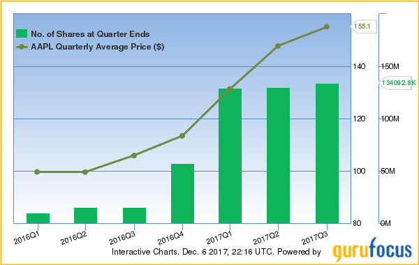
Figure 4: Buffett's Trade History for Apple
Unfortunately for investors, the industrials and technology sectors are significantly overvalued compared to other sectors. Companies in these two sectors represent 28% of all NYSE and Nasdaq companies whose P/S is greater than the 70th percentile of the industry, and 27% of the companies with a P/S greater than the 80th percentile of the industry. The respective values increase to 37% and 39% when we consider just the S&P 500 companies. Figures 5.1 and 5.2 show the sector breakdown for NYSE and Nasdaq companies, while Figures 6.1 and 6.2 show the sector breakdown for S&P 500 companies.

Figure 5.1

Figure 5.2

Figure 6.1

Figure 6.2
Industrials and technology companies have above-average price-sales valuations
To determine which companies are significantly overvalued based on their price-sales ratio, we can look at the company's price-sales valuation chart and / or the median price-sales valuation line. The latter is similar to the Peter Lynch earnings line, except we compare the company's stock price to the trailing 12-month revenue per share multiplied by the 10-year median price-sales ratio. Figure 7.1 shows Apple's price-sales valuation chart and median price-sales valuation line for the past 5 years.

Figure 7.1: Five-year Price-Sales Valuation Chart for Apple
As illustrated in Figure 7.1, Apple trades approximately $15 higher than its median price-sales valuation. The company has five medium warning signs, including a price near a 10-year high and a price-sales ratio near a 12-month high.
We can see a similar pattern with the price-sales valuation charts for Buffett's major positions as illustrated in Figures 7.2 to 7.5.
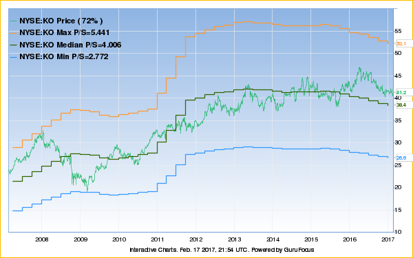
Figure 7.2: 10-year Price-Sales Valuation Chart for Coke

Figure 7.3: 10-year Price-Sales Valuation Chart for IBM
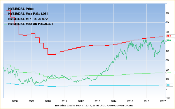
Figure 7.4: 10-year Price-Sales Valuation Chart for Delta
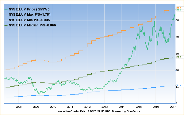
Figure 7.5: 10-year Price-Sales Valuation Chart for Southwest
Figure 7.6 shows Southwest's Peter Lynch chart.

Figure 7.6: 10-year Peter Lynch Chart for Southwest
Although Southwest traded below its Peter Lynch earnings line from mid-2015 to late 2016, the Dallas-based low-cost airline converged to its maximum price-sales valuation during the second half of 2016 as crude oil prices increased approximately $20 per barrel. Figure 8 illustrates Southwest's share price compared to the crude oil prices for the past three years.
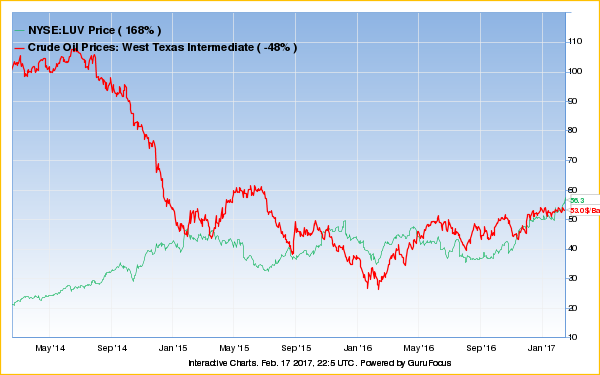
Figure 8
Conclusions and see also
As the stock market valuations continue to increase, gurus are generally selling shares in S&P 500 companies. You can view an overview of the net buys with the S&P 500 grid, which organizes the company stocks with the highest number of net buys in the upper-left corner to those with the highest number of net sells in the lower-right corner. The S&P 500 grid feature allows you to look at ownership or just buys and sells. You can also change the stocks of interest to non-S&P 500 companies or companies within a specific market cap.
Premium members have access to portfolio information on over 150 gurus, all value screeners and the Aggregate Portfolio of Gurus. Two model portfolios, the Buffett-Munger portfolio and the Most Broadly Held portfolio, have outperformed the S&P 500 benchmark in at least seven of the past eight years. If you are not a GuruFocus Premium member, we invite you to a free seven-day trial.
Disclosure: The author has no positions in the stocks mentioned.
This article first appeared on GuruFocus.
Warning! GuruFocus has detected 7 Warning Signs with KO. Click here to check it out.
The intrinsic value of KO
